


François Lidove
Year
2019
What we did
- Visual identity
- Motion graphics
- Sound Branding
- Web design
Introduction
With 8 years of experience François Lidove is a broadcaster French who exercise their profession in the field online, so that your identity should be focused in the digital environment.
The profession of the speaker offers a service that literally do not see, only hear, so the way to visualize this is usually done with the image of the own speaker, in our case will be “the voice of written” which has the weight of the identity.
The profession of the speaker offers a service that literally do not see, only hear, so the way to visualize this is usually done with the image of the own speaker, in our case will be “the voice of written” which has the weight of the identity.
Target Audience
The work of François is primarily aimed at recording studios, agencies voices and producers with a level of professionalism is very high, in which the quality of service is paramount.
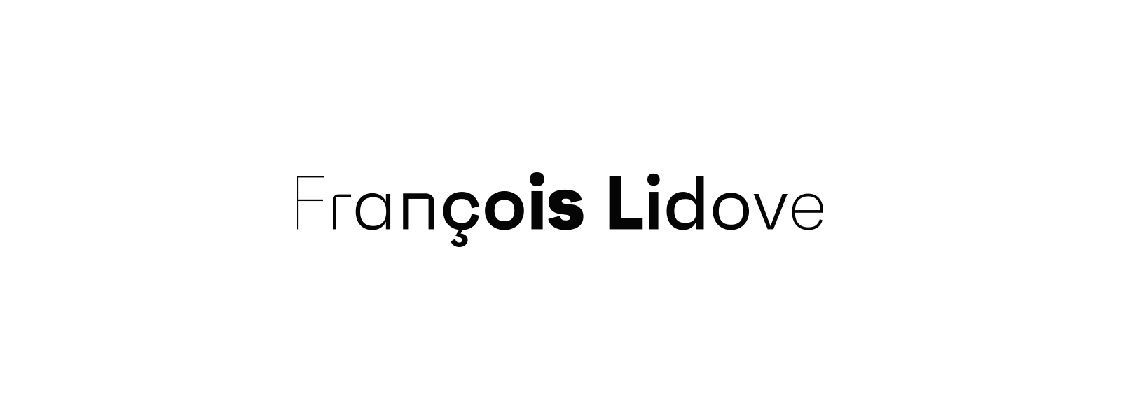
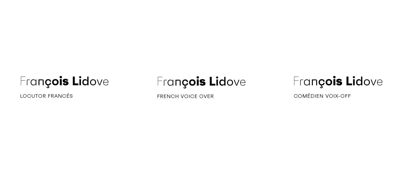
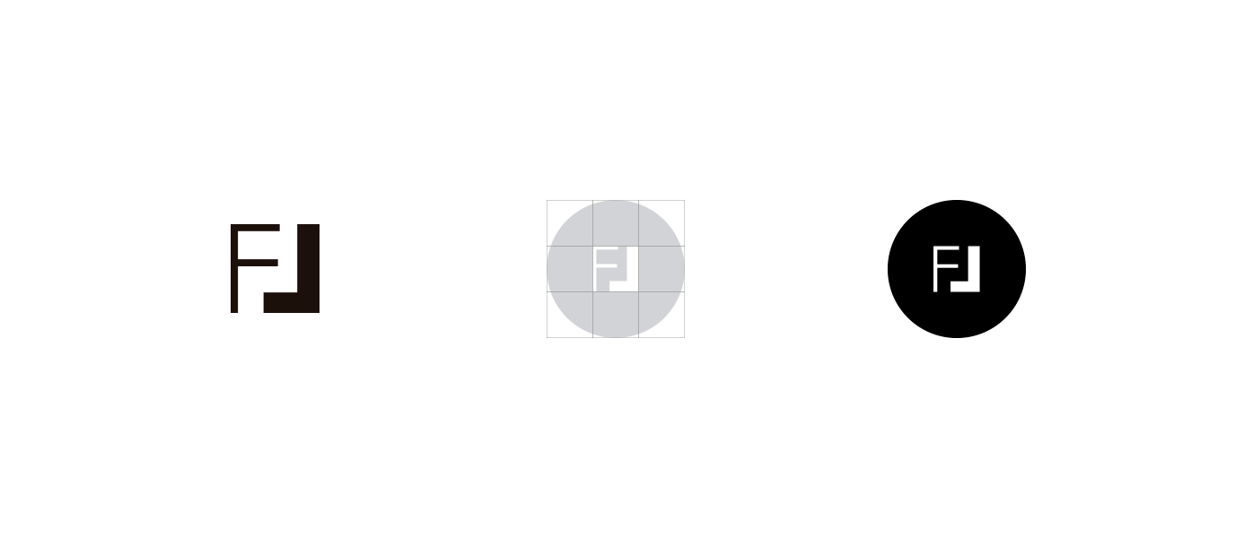
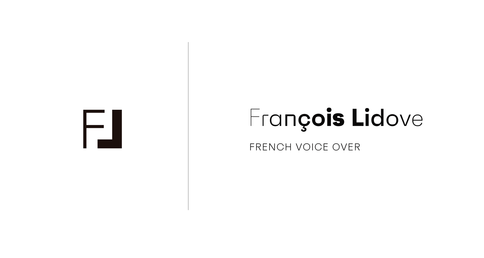
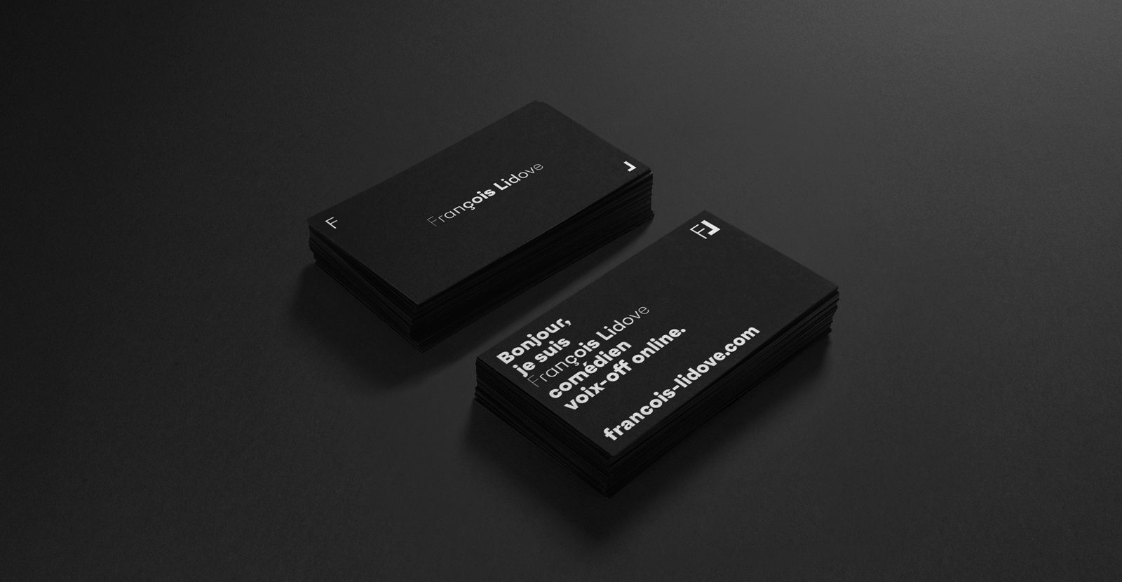
We use it as a logo, the name and surname of François. The design is inspired by the representation of a sound wave, using different weights of typography to represent the variation of the amplitude.
All the brand uses the same font, even the logo, to differentiate it from the rest of the texts we use alternatives, stylistic on some letters.
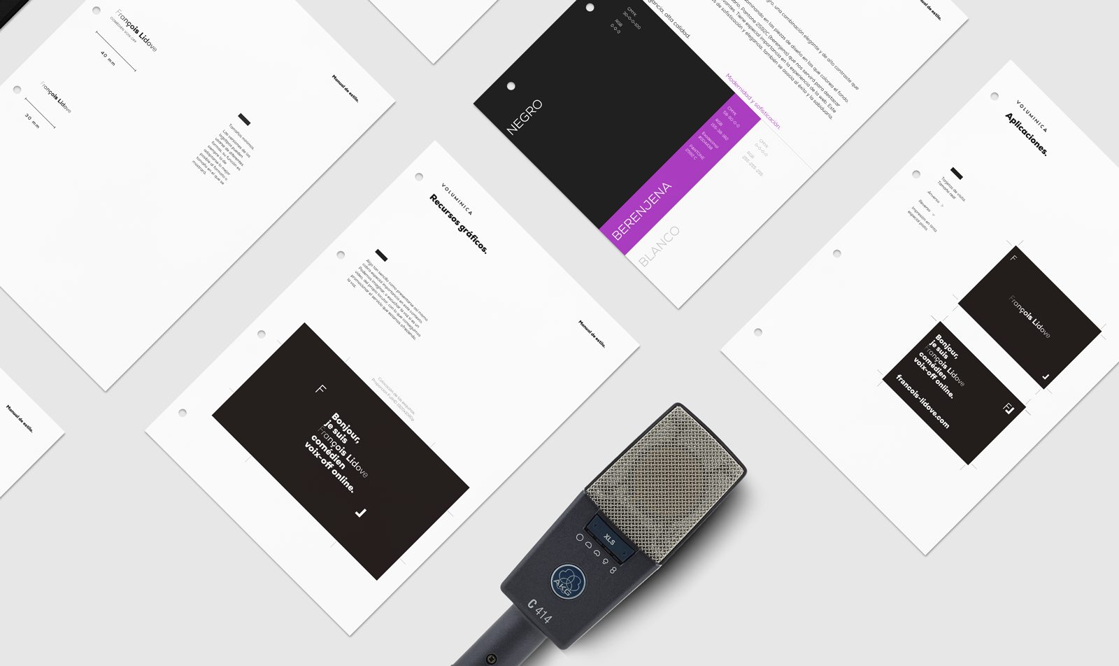
Color
We opted for the pairing of White and Black, a combination of elegant and high contrast that will highlight the typography of the brand.
The black is the main color, to prevail in parts of the layout that colors the background.
The black is the main color, to prevail in parts of the layout that colors the background.
We use a secondary color, Pantone 2592C (eggplant) that will allow us to highlight information or details that are relevant. Has special importance in the experience of the web. This color accentuates the values of sophistication and elegance, is also associated with the success and wisdom.
Deep black
CMYK 30-0-0-100
RGB 0-0-0
#000000
Pure White
CMYK 0-0-0-0
RGB 255-255-255
#FFFFFF
Eggplant
PANTONE 2592C
CMYK 58-90-0-0
RGB 155-38-182
#9E28B5
Typography
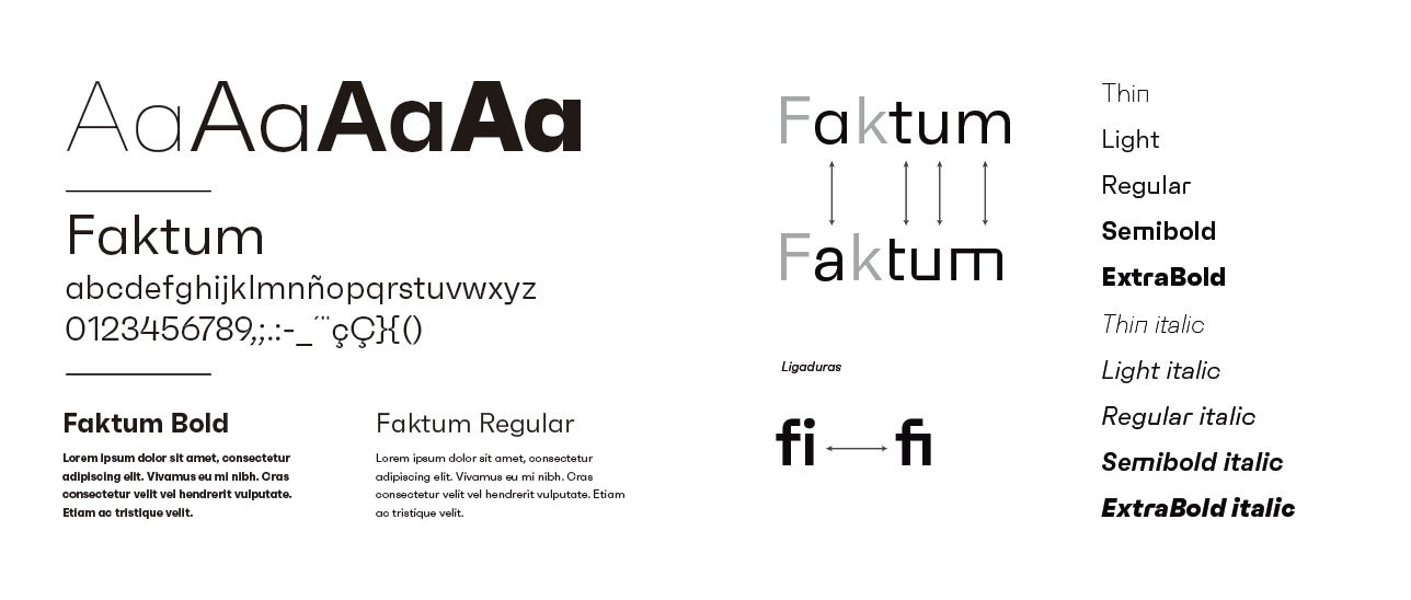
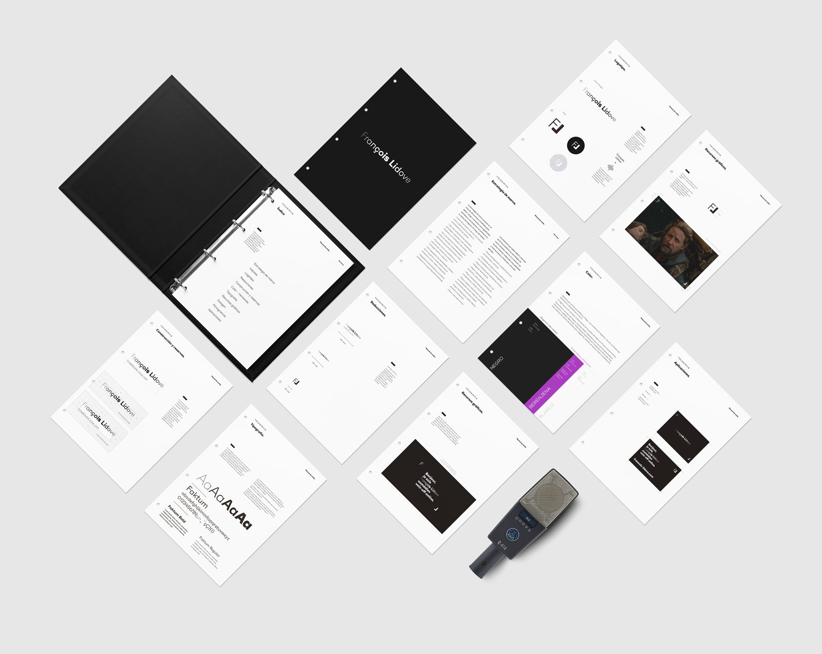
With the objective of maintaining a coordination and a typographical unit in all of the elements of corporate id, are set to use the same font family to make a composition of all the texts of information and communication of general use.
The combination of clear lines, organic curves and geometric shapes, highly popular among designers and architects of the second third of the TWENTIETH century, offers a contemporary style and original.
The family offers a wide range of alternate characters and ligatures.
Thanks to its clean lines and its structure slightly organic, Faktum works well in different sizes and settings, from source to long paragraphs or highlighting owners of powerful.
The family offers a wide range of alternate characters and ligatures.
Thanks to its clean lines and its structure slightly organic, Faktum works well in different sizes and settings, from source to long paragraphs or highlighting owners of powerful.
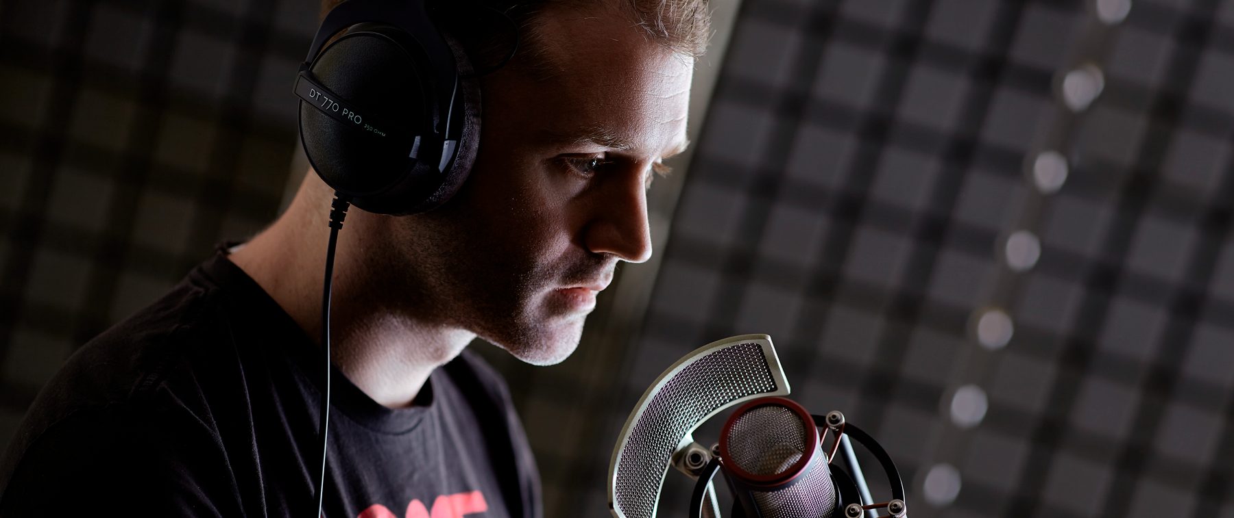
Photography: Daniel Jorge – Study Images and Sensations – Madrid
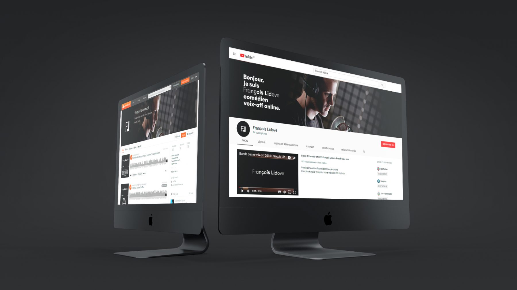
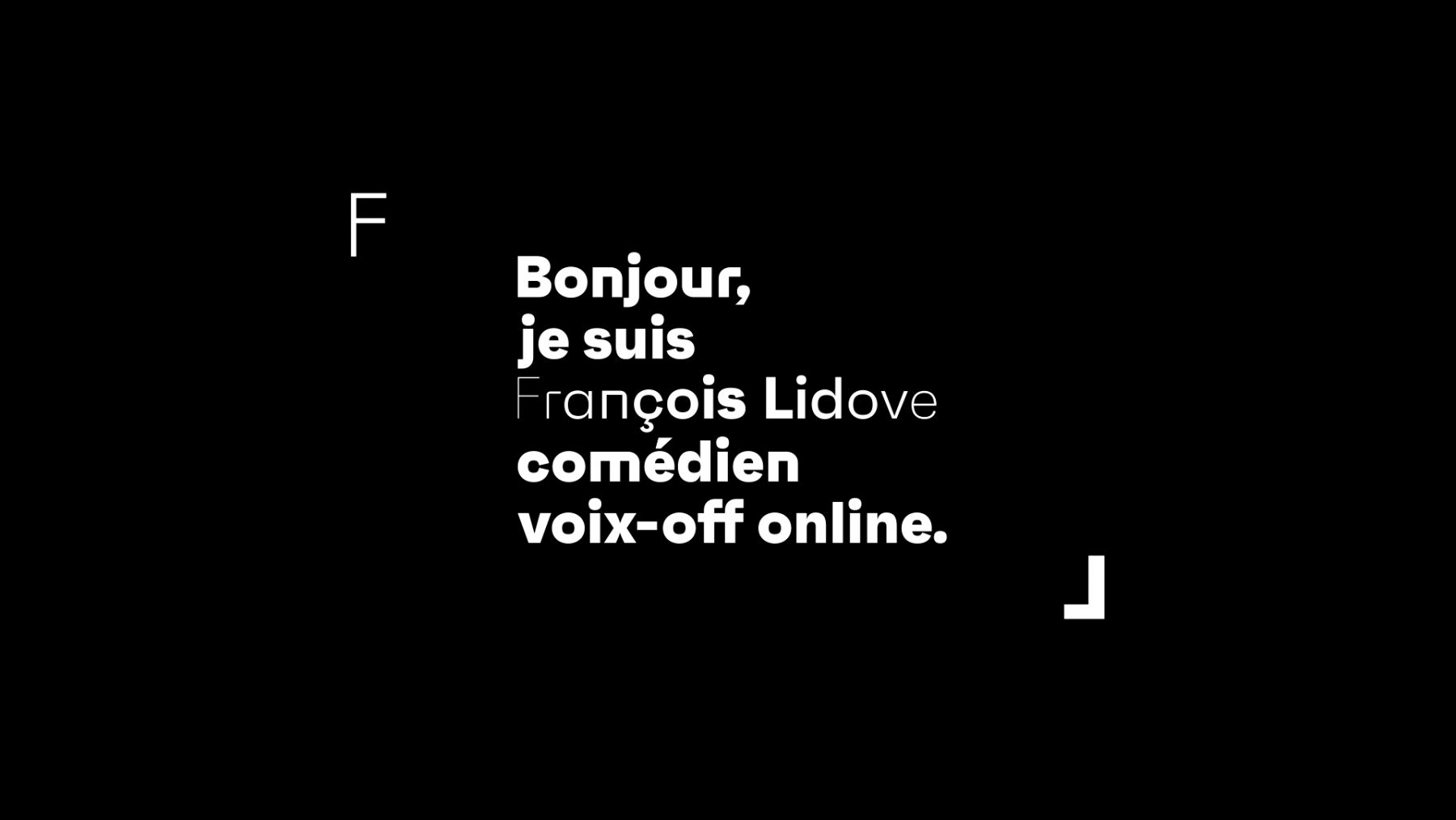
Something as simple as presenting oneself is of particular importance in this context. We can imagine, or to hear the voice of the own speaker, allowing us to promote the service that we are offering.
"Hello, my name is François Lidove, I'm a speaker online"
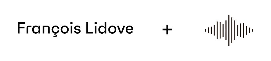
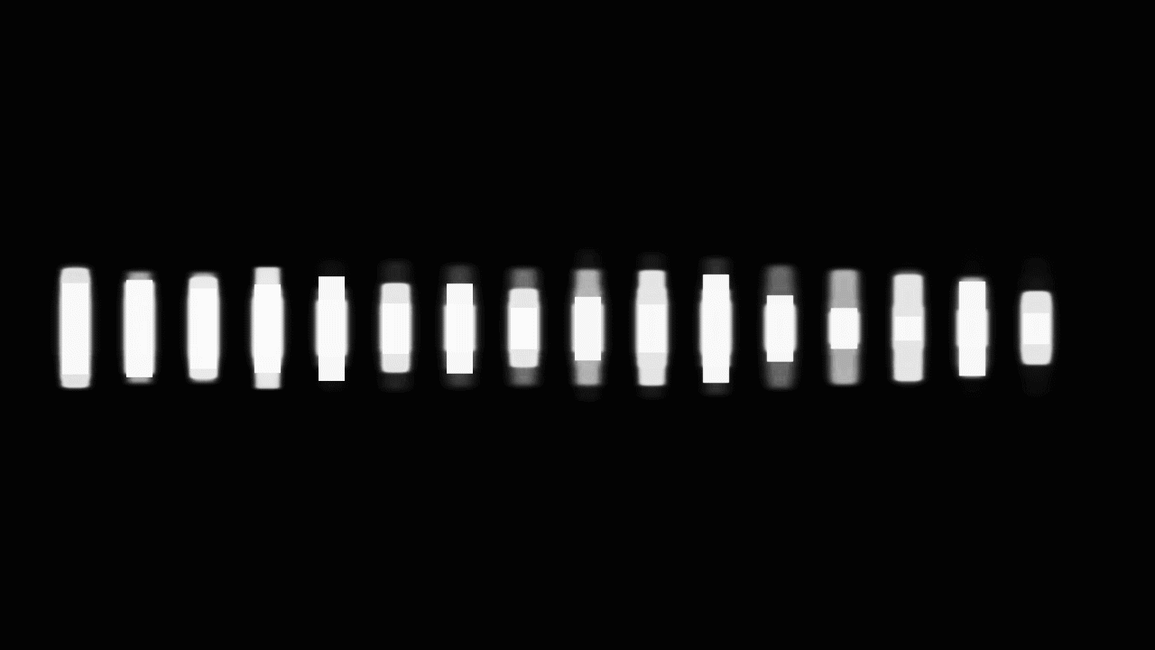
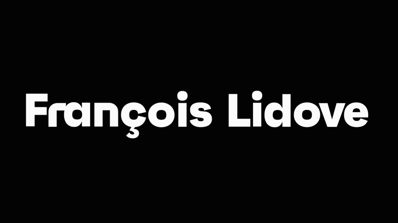
The logo should have an animated version that would be used as a lead in the reels that François used to display your work. As is logical, it was important to the study of the sound in the video, we wanted a sound very personal and identifiable, that is a better choice than the own voice of the speaker appeared.
The sound branding was a production of Marcos Cabal + François Lidove.
Animation entry and exit corporate: Volumínica
Editing: Nicolas Martin – NM Prod – Paris
If you enjoyed this project, take a second to share it, thanks