
THESIS
Year
2022
What we did
- Visual identity
- Web design
Starting situation
With more than 15 years of experience in the sector of the health solutions focused on the patient, support the development of their products in a
important previous research.
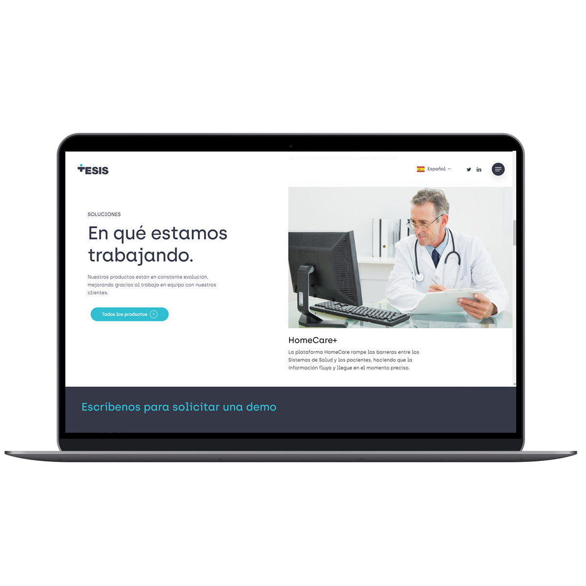
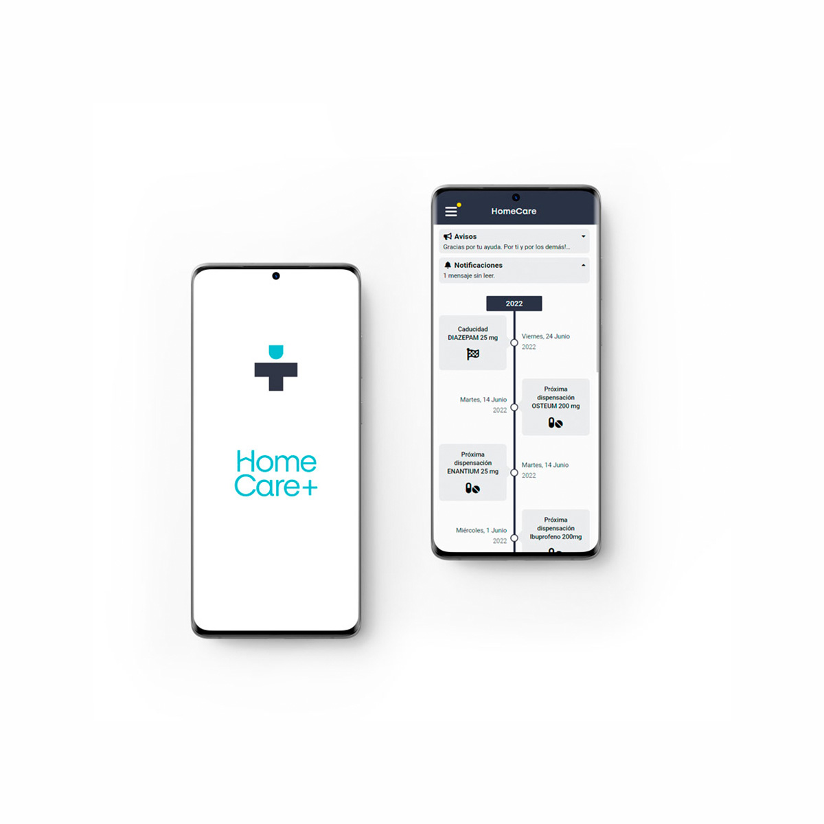
For one of their products, “HomeCare” we designed a technology platform that allows for the creation and development of applications such as portals, patient management and follow-up of chronic diseases, integration with devices of IOT (Internet Of Things). The strong point is that it integrates perfectly with the circuit of the patient and with the Electronic medical record. It is very versatile and very little time to adapt to nearly any environment and health.
Brand strategy
We have defined an identity that embraces the values of the brand and offers a path consistent for the design of the new apps that the company will be creating.
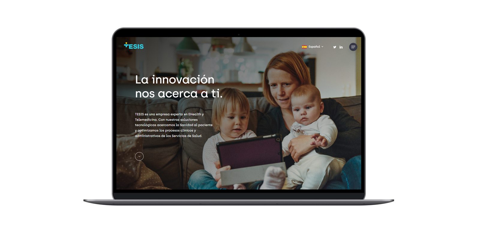
We pursue to offer a message of innovation and trust, with the point of view on improving the lives of people. The visual language seeks to convey a sense of transparency and openness; building a distinctive style, close and stylish.
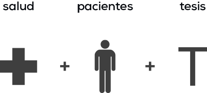
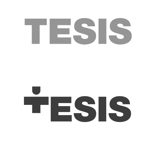
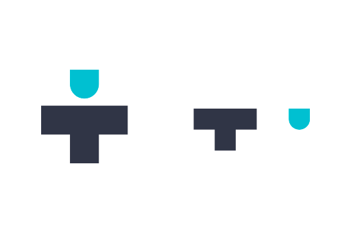
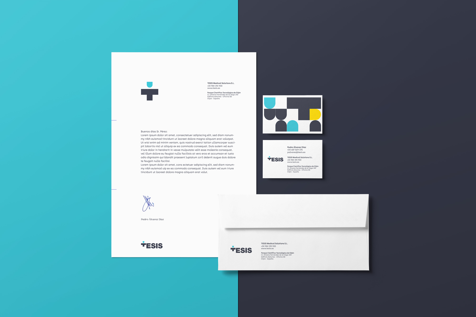
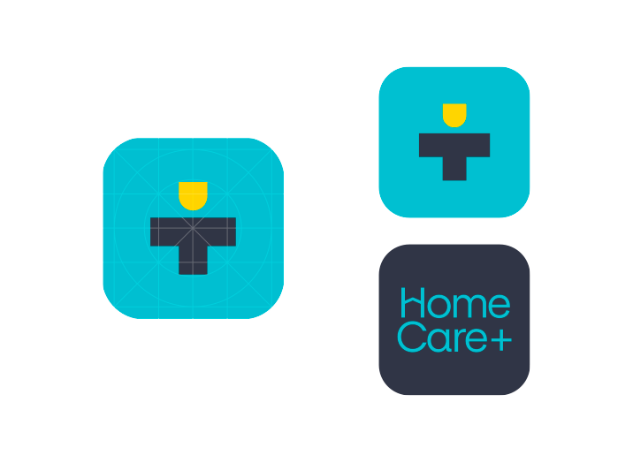
Isotype
The logotype is inspired by the cross sanitaría as a recognizable icon of the health and the pictogram of a person as a reference to the deal close and focused on the patient. We also seek that the concept could join the letter T to work together in the logo or in isolation as isotype.

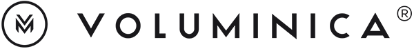
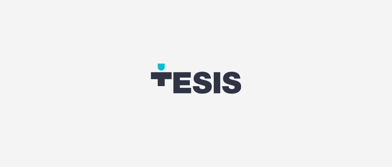
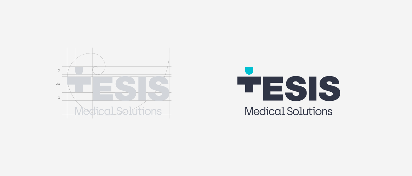
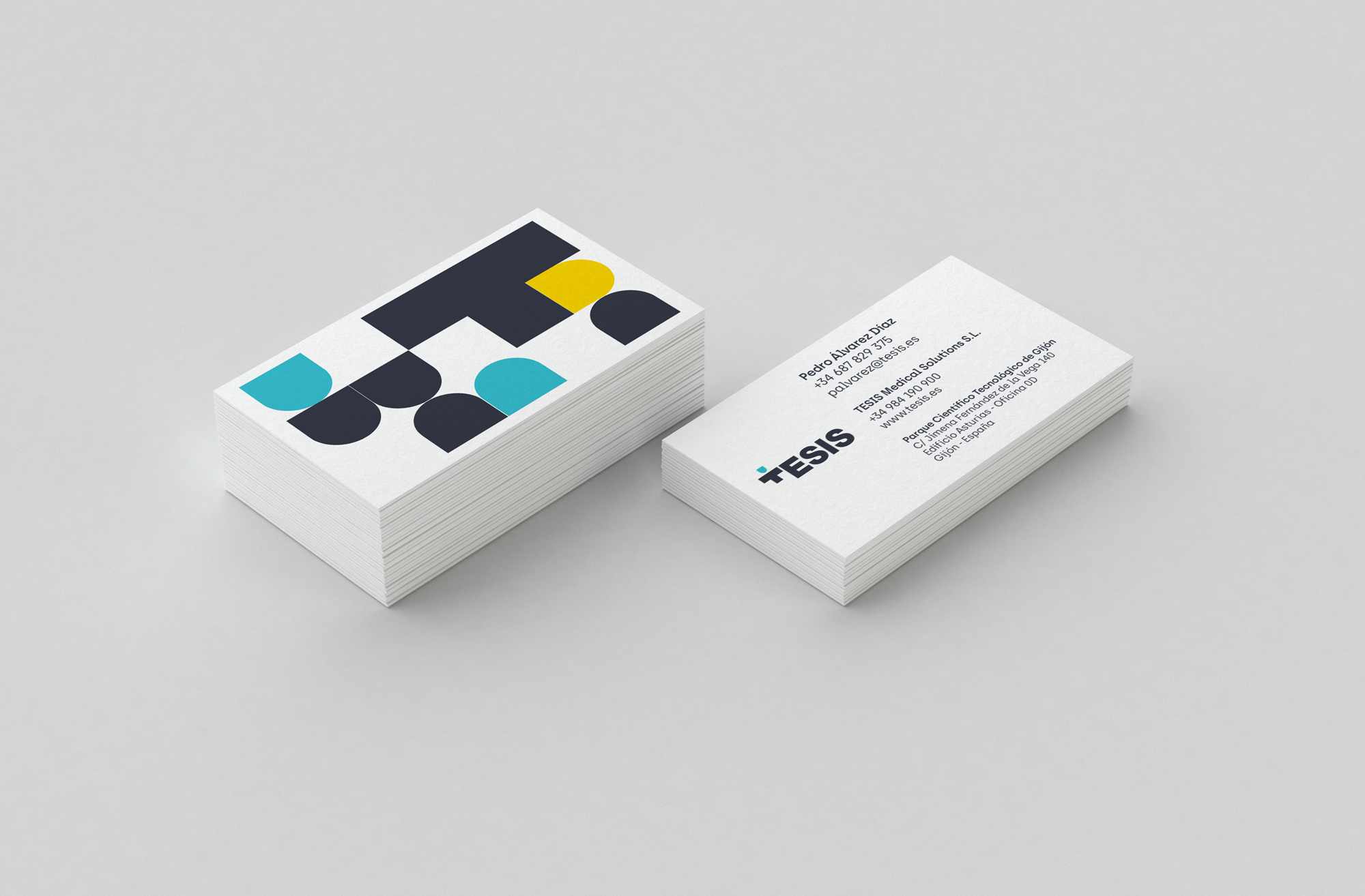
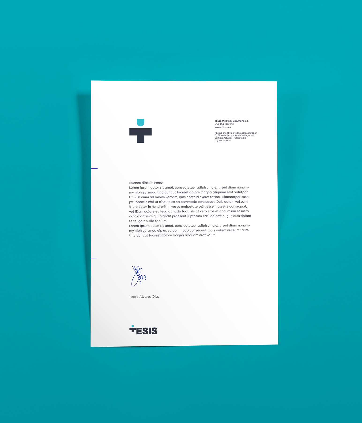
Logo
The logo is an identifier that is formed by the letters. We are looking for a serious image and rotunda, which provides the trust of a large company, the use of typography in capital letters and a weight of lyric coarse, accentuate this idea.
We substitute T by isotype, creating a design unique and differentiating.
We chose Helvetica, a typeface created in 1957, widely used in the design of logos for its readability and transparency.
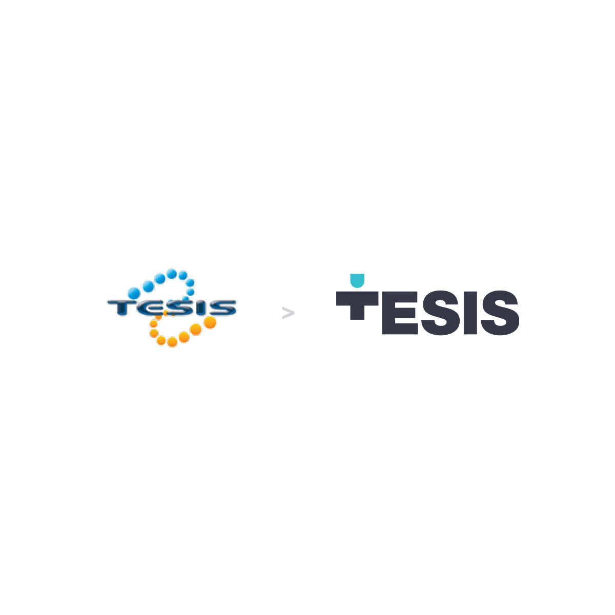
Old logo to the left, redesign to the right.
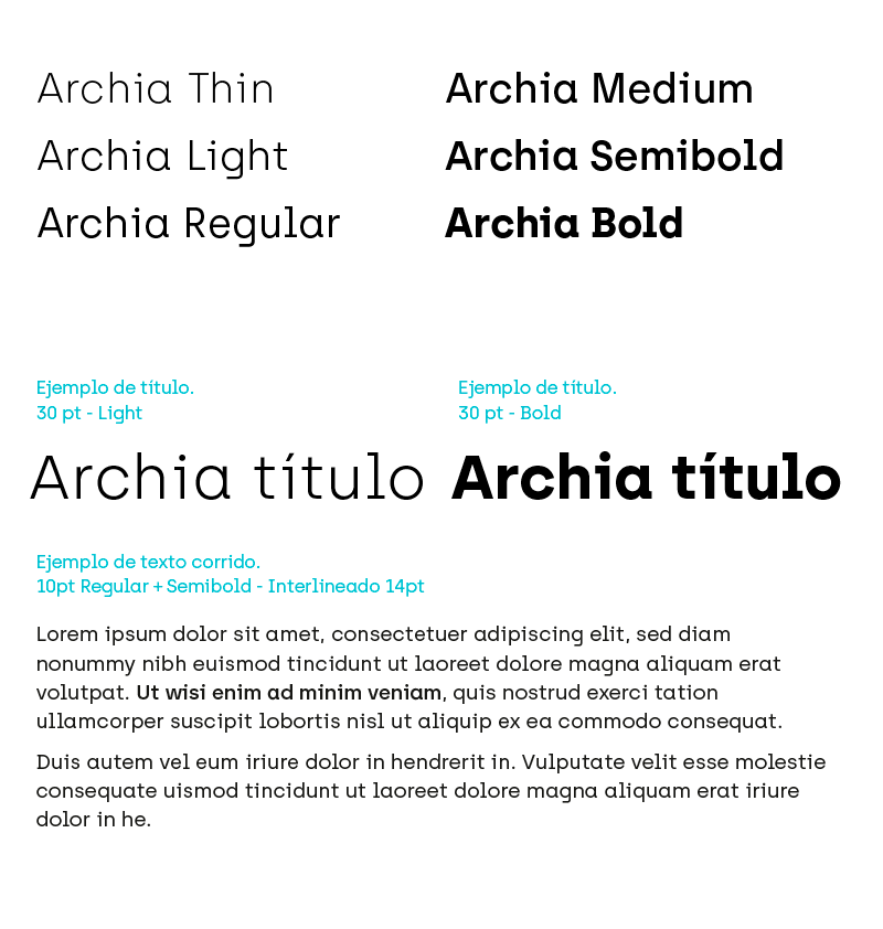
Typography corporate
With the objective of maintaining a coordination and typographical unit in all of the elements of corporate id, are set to use the same typeface to make the composition of all text information and communication of general use.
Archia
It is a sans serif typeface based on geometric shapes and an approach to "technological".
The result is a family of fonts moderna and unorthodox, with subtle details in the borders that make it to the next spot and innovative.
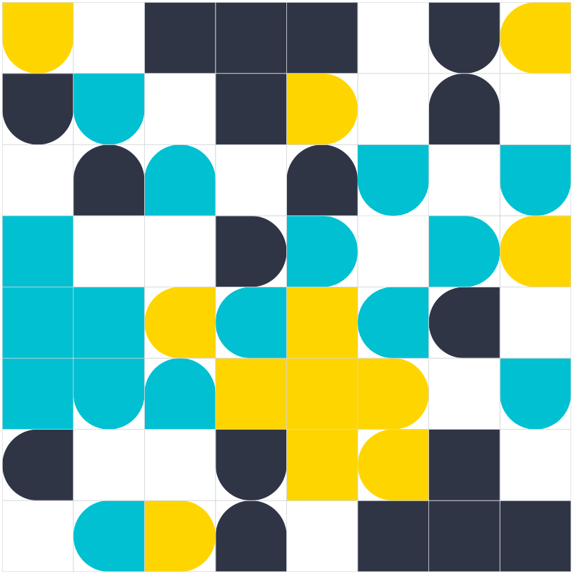
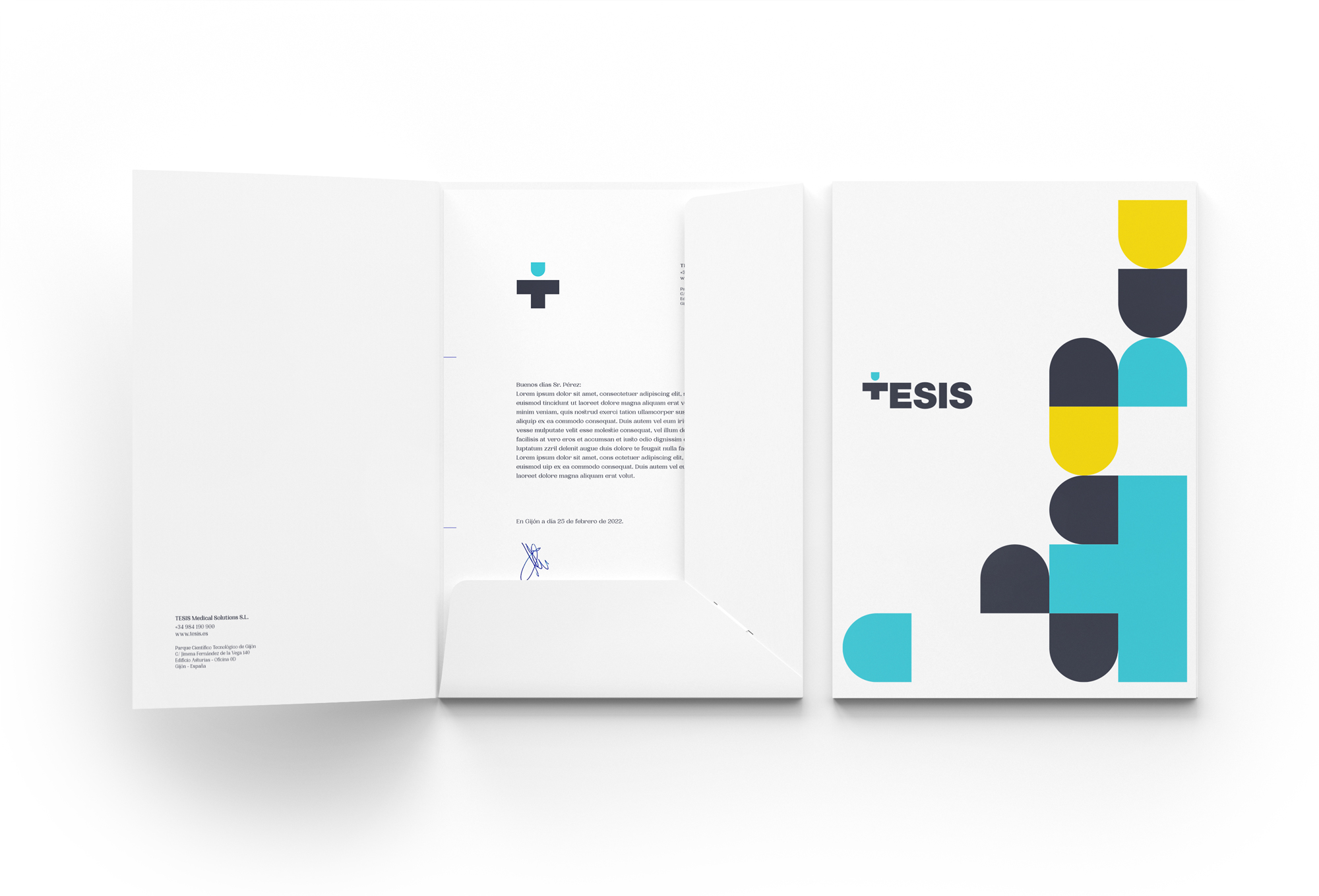
Graphic resources
Graphic resources corporate enrich the visual aspect of the brand and help to identify it more easily.
On a grid of square base descontextualizamos the basic geometries that form the isotype to create compositions colorful and dynamic.

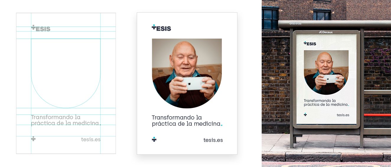
Posters
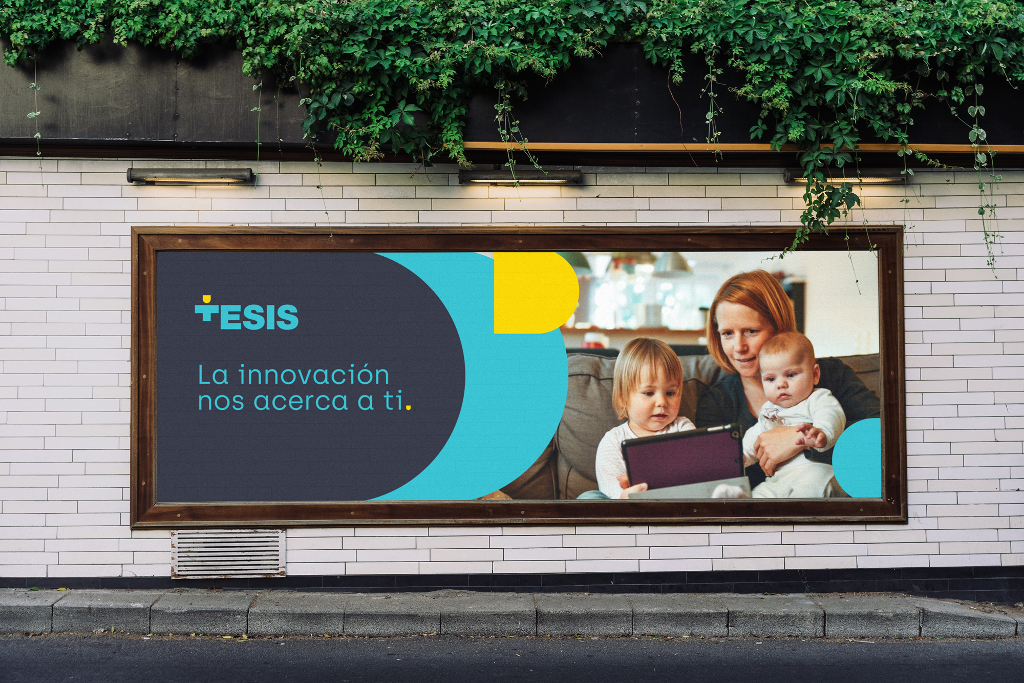
On the occasion of the creation of the new identity we created a campaign of marquees in which the messages were looking for closeness, the technology that makes it easy to get it.

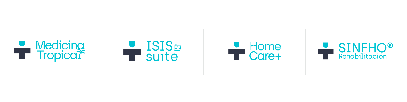
Other products
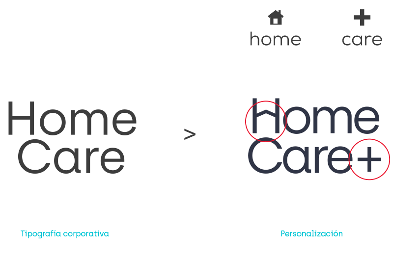
We created a visual language and a design scheme to reduce costs in the creation of the identity of the goods that generates a THESIS, using the typography corporate as a resource for identification of the brand, we add several features to idenitficar each product.
APPs corporate
For the APP we will use the fonts corporate Archia, and Roboto.
Reserve the use of Archia for titles, highlights, and moments in which we use a few words.
Roboto for continuous text, your design more neutral allows a better and more comfortable reading.
If you enjoyed this project, take a second to share it, thanks