


Plexigrid
Year
2020
What we did
- Visual identity
- Web page
- Packaging
Starting situation
Plexigrid is a new company. You try to fill the gap created between the traditional way in which they have designed the electrical systems and the advances in new technologies, offering solutions that enable network operators to power to lead the transition to a sustainable energy system.
The growth of technologies that need electrical energy (electric vehicles, heat pumps, etc) are producing overloads in the network, the traditional solution to increase the wiring opening trenches in the city will be replaced by a dynamic management and efficient use of the energy by means of computer programs. This will save operators between 12,000 and 16,000 million euros per year.
For consumers, the electric company can offer their customers rates FULL (with full capacity at any time of the day, or FLEX fares more economic with almost full capacity less in the hours of greatest congestion of the system, for example.
Brand strategy
– Create a corporate image distinctive and recognizable, which identifies the company by means of a visual communication and attractive moderna, focused on a public career goal.
– Reflect an innovative business model and sustainable.
– Use of language, without technicalities, it matters to us that you are aware of the advantages of the product, is defined by what to get the product but without delving into the how.
Technological, Innovative, Sustainable.
Inspiration
The visual identity of Plexigrid is inspired by elements of branched that remind us of the power grids.
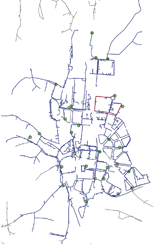
Electrical Networks.
The ramifications of the electrical wiring of a city.

Trees.
Because of their similarity to a system of network power and as a symbol of sustainability.
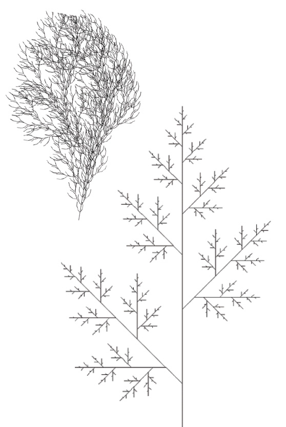
L-system.
Set of rules and symbols, mainly used to model the growth process of the plants, although you can also model the morphology of a variety of organisms.
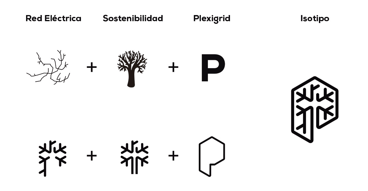
Isotype.
The design is inspired by 3 factors:
– A system structure that reminds us of an electrical network.
– A tree, as a symbol of sustainability, its branches also remind us of the power grids.
– The “P” as the initial letter of the name Plexigrid.
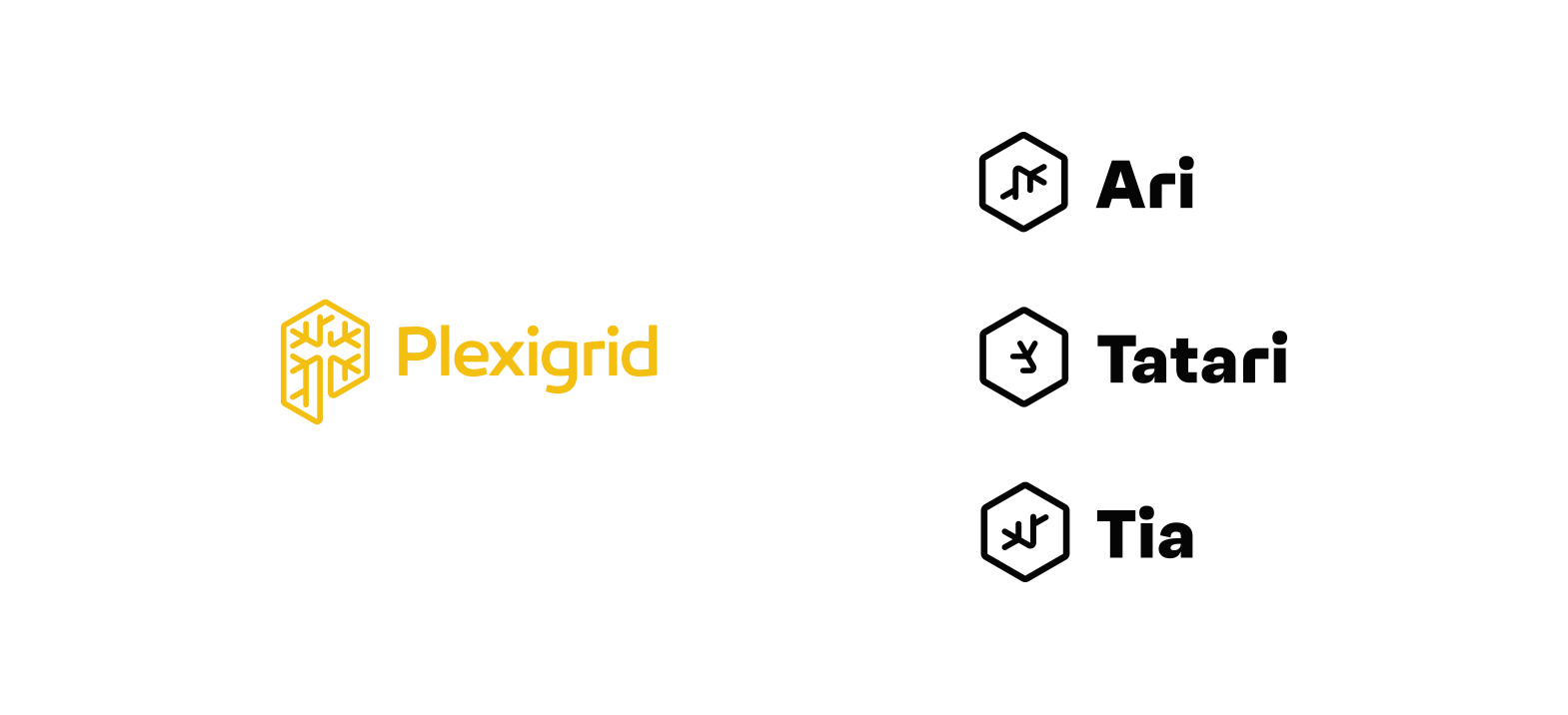
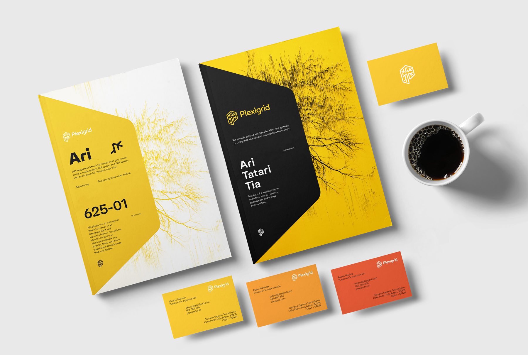
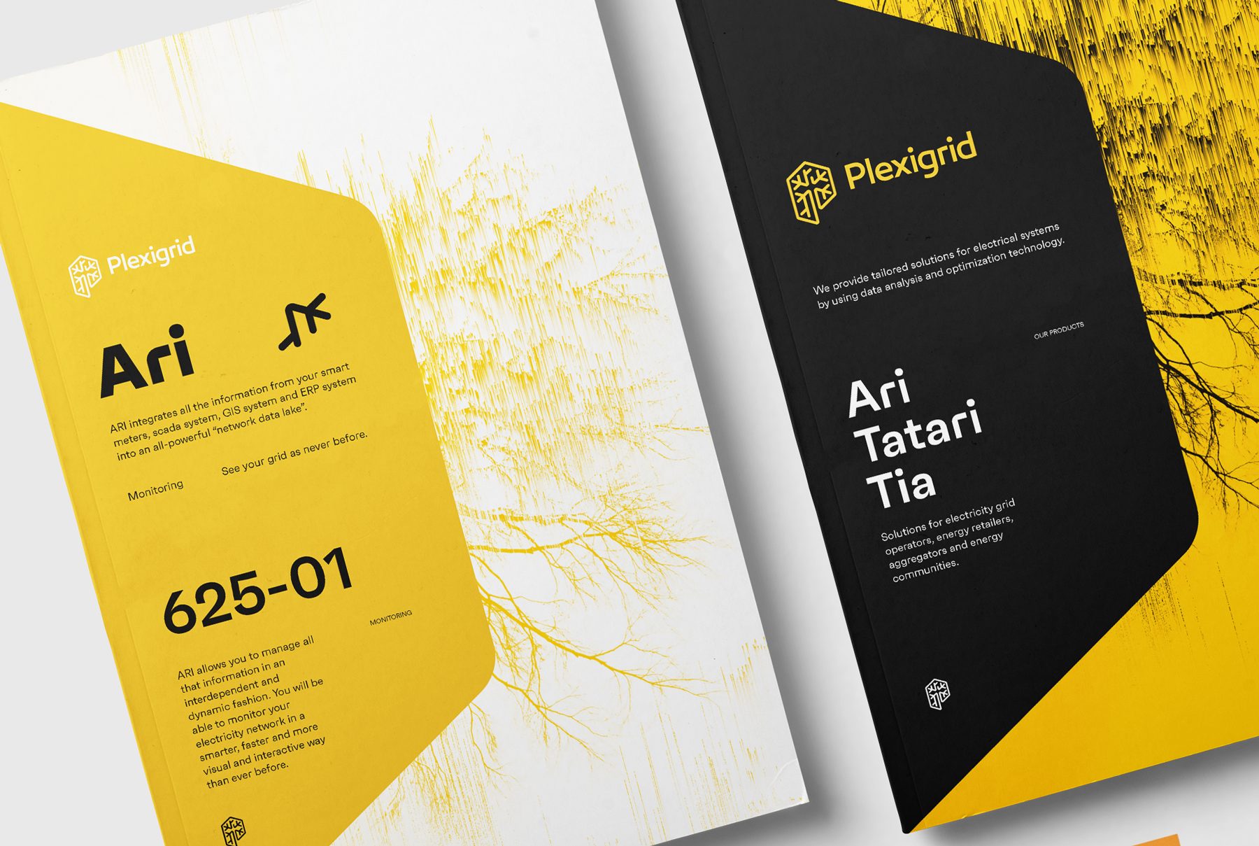
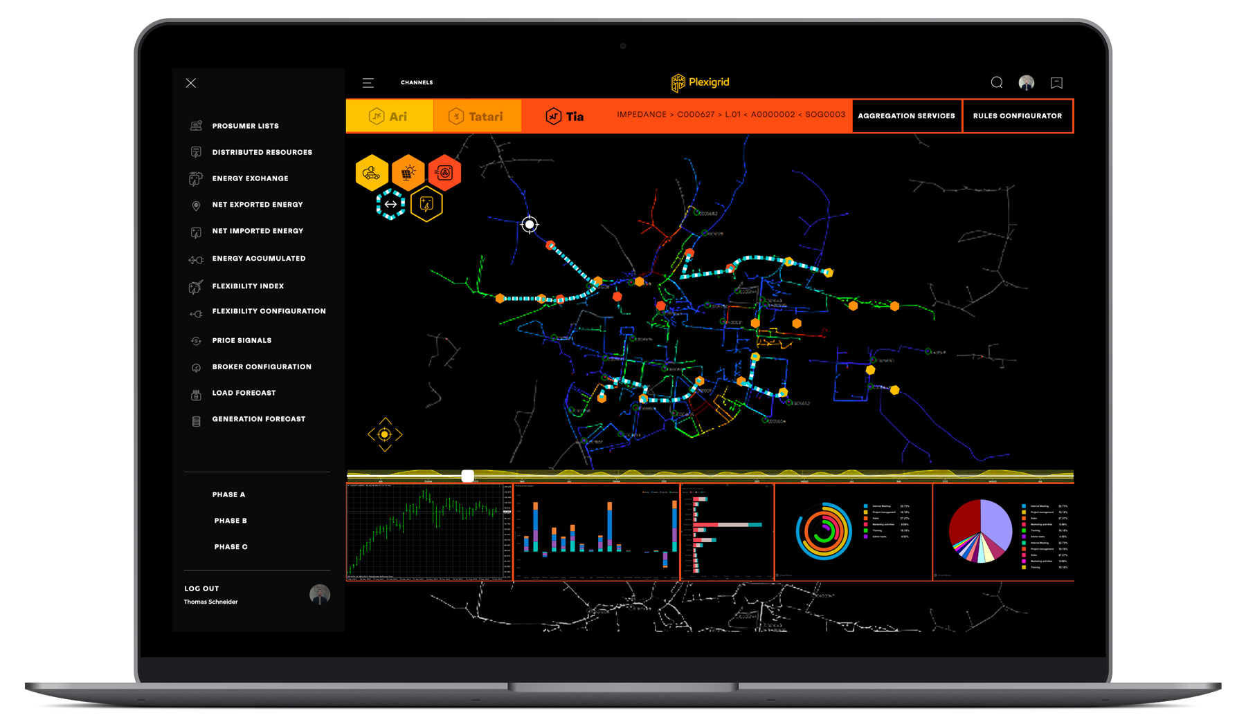
Products.
Plexigrid has created a series of application services that meet different needs.
For this reason, we have designed a packaging that simulates a physical product but in reality it is not.
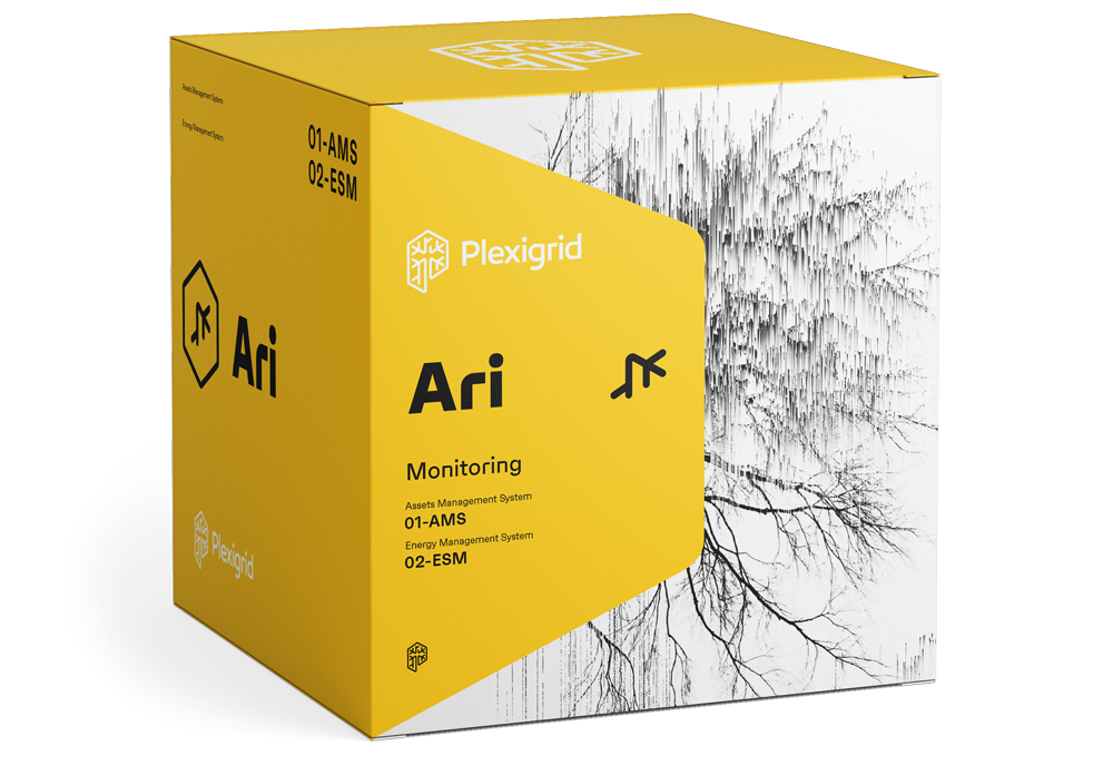
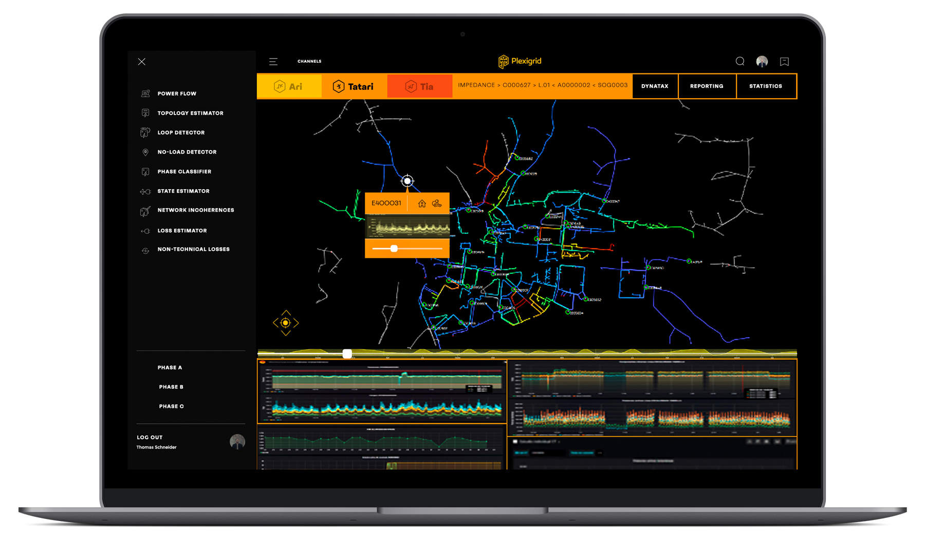
Ari (display)
Monitors the electrical network as never before.
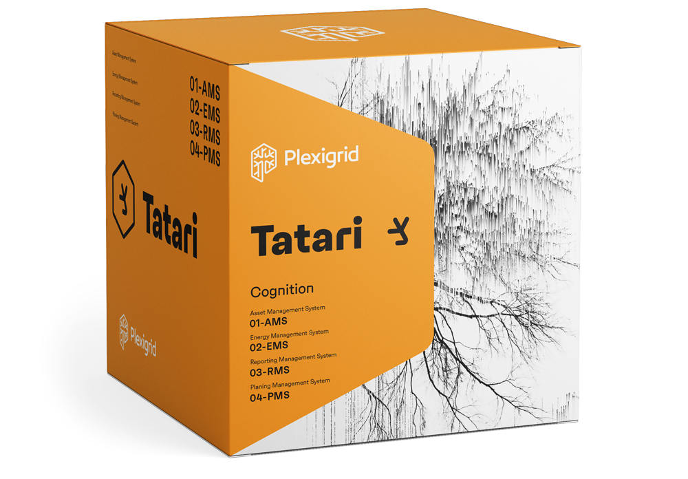
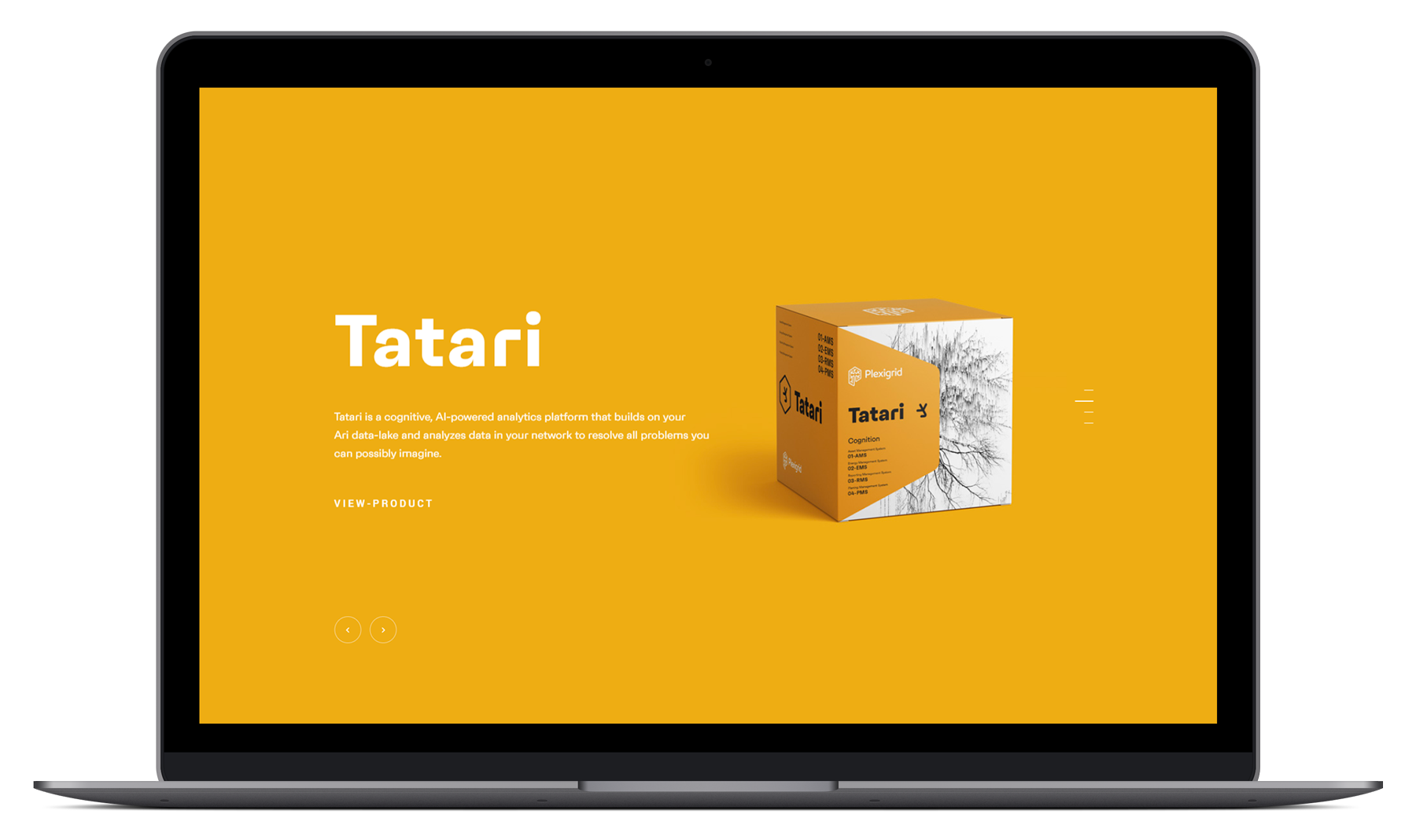
Tatari (Understanding)
Creates a network that is really smart.
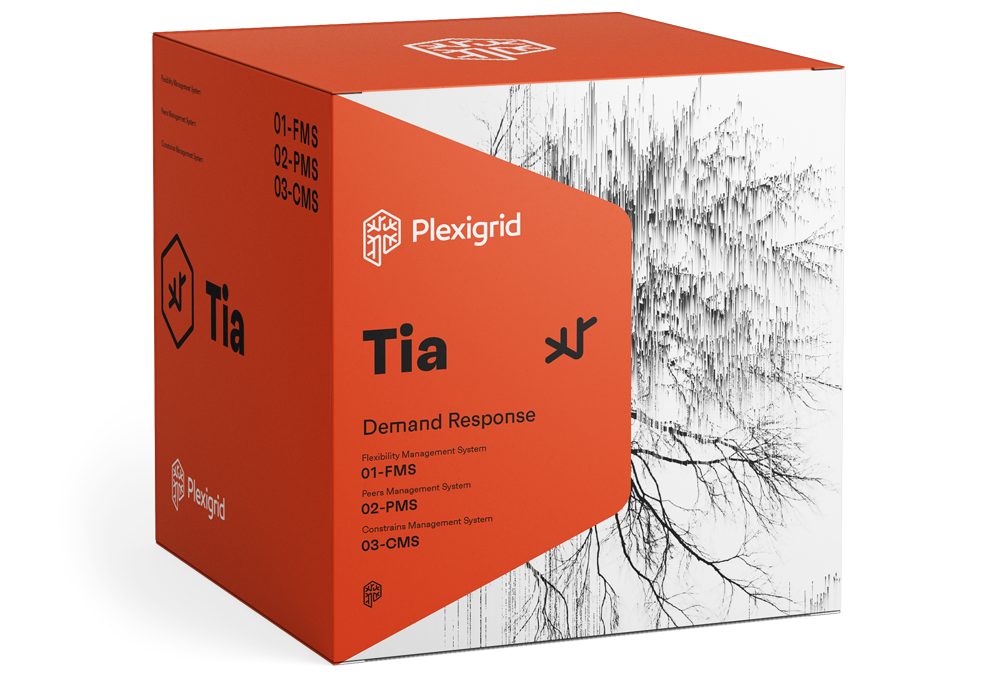
Tia (Cognition)
Releases the potential flexibility of the network
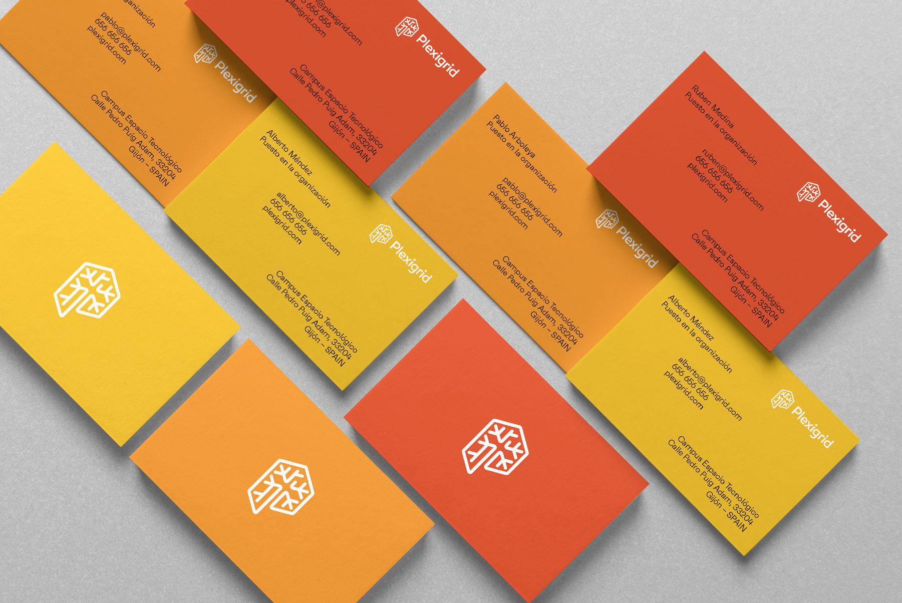
Color
The yellow is the main color of the brand, for the other two we choose a range of warm colors that help define the different products.
Yellow
Main Color
#F4C020
Orange
Secondary Color
#ED9026
Red
Secondary Color
#DB4B25
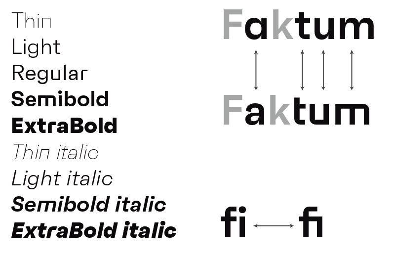
Typography corporate
With the objective of maintaining a coordination and typographical unit in all of the elements of corporate id, are set to use the same typeface to make the composition of all text information and communication of general use.
Faktum
The combination of clear lines, organic curves and geometric shapes, highly popular among designers and architects of the second third of the TWENTIETH century, offers a contemporary style and original.
The family offers a wide range of alternate characters and ligatures.
Thanks to its clean lines and its structure slightly organic, Faktum works well in different sizes and settings, from source to long paragraphs or highlighting owners of powerful.
The family offers a wide range of alternate characters and ligatures.
Thanks to its clean lines and its structure slightly organic, Faktum works well in different sizes and settings, from source to long paragraphs or highlighting owners of powerful.
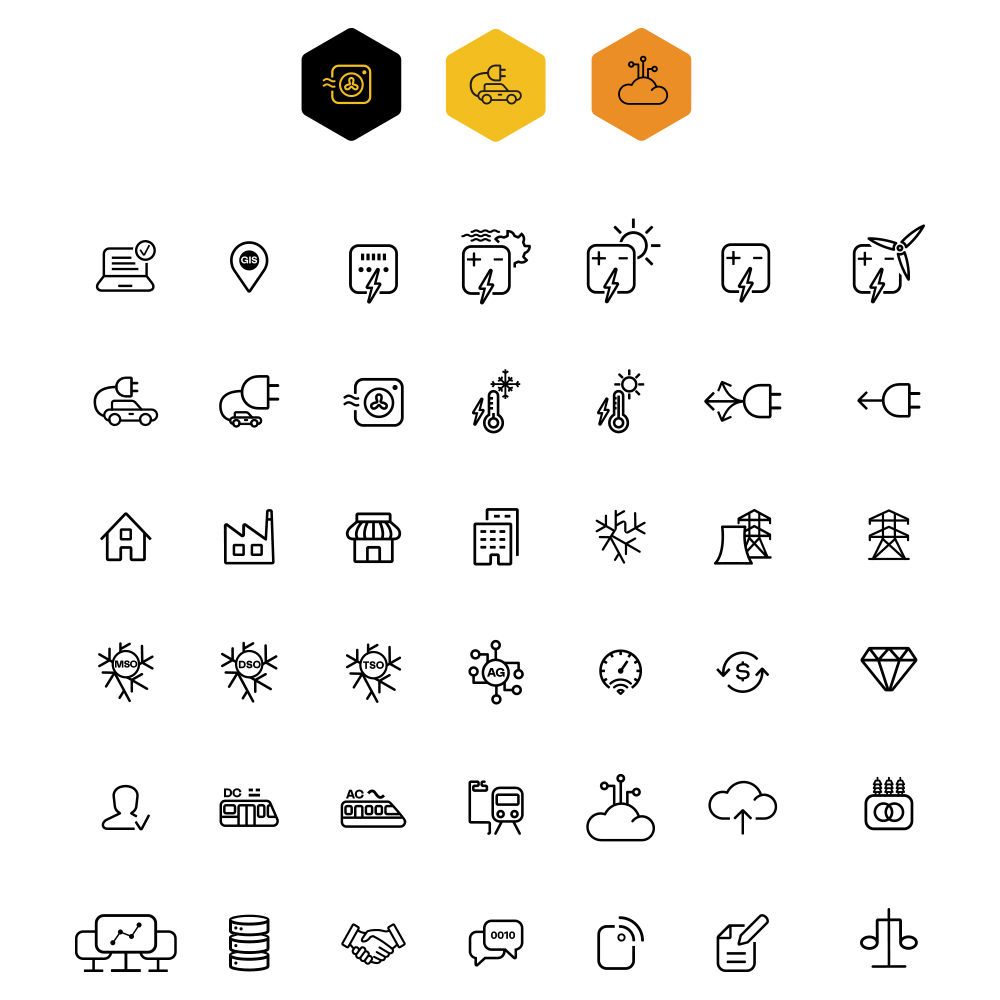
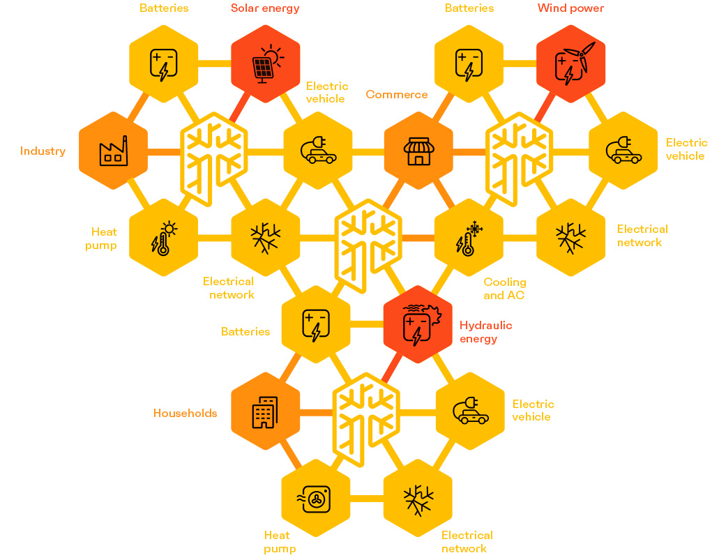
Icons.
We designed a 42-icons that help to explain some of the rules of operation of the products.


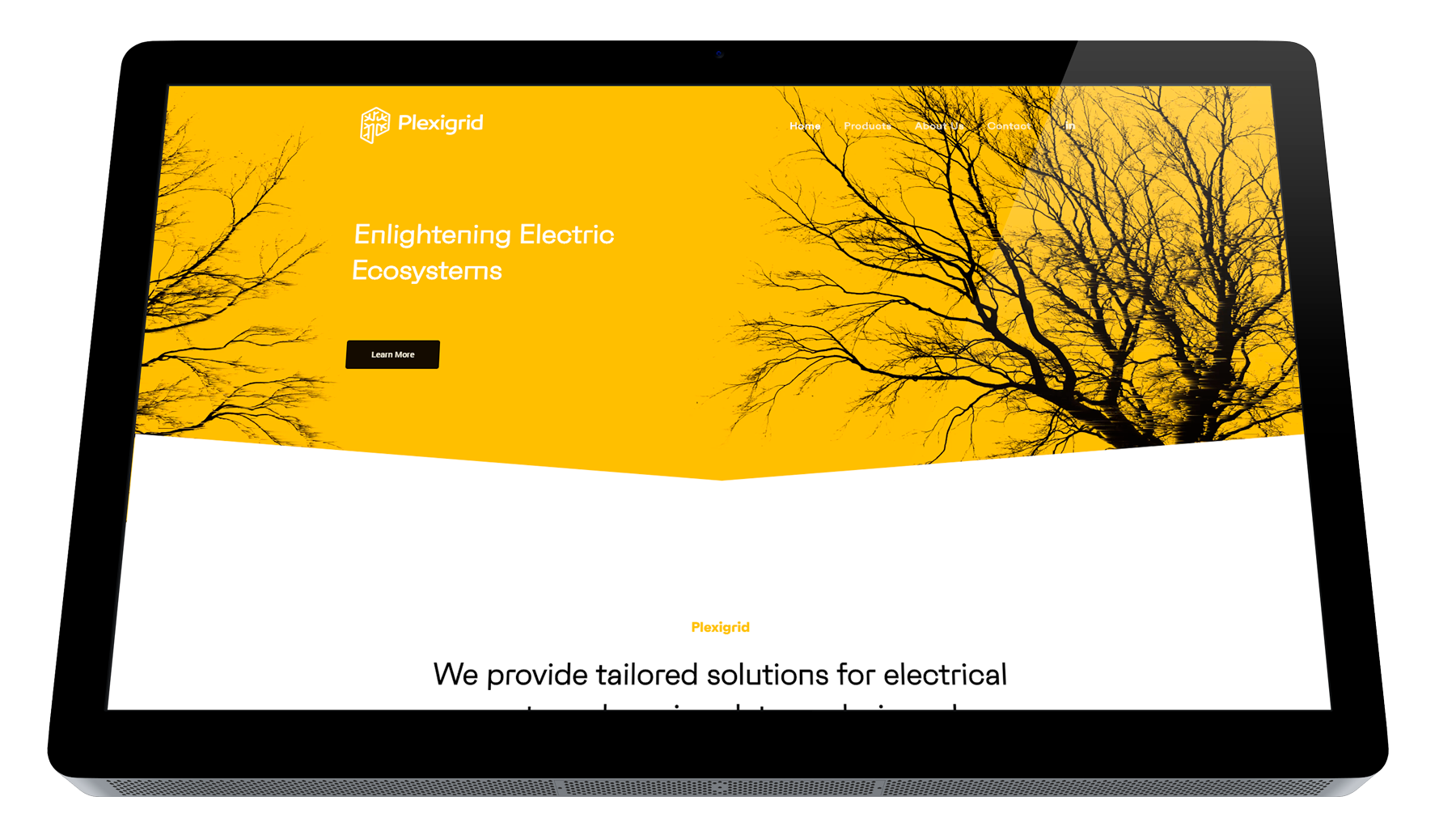
Web.
In the website focus attention on the products, presented in a manner that is clean and attractive, which is supplemented with a colloquial language and entertaining to facilitate the understanding of concepts.

If you enjoyed this project, take a second to share it, thanks