


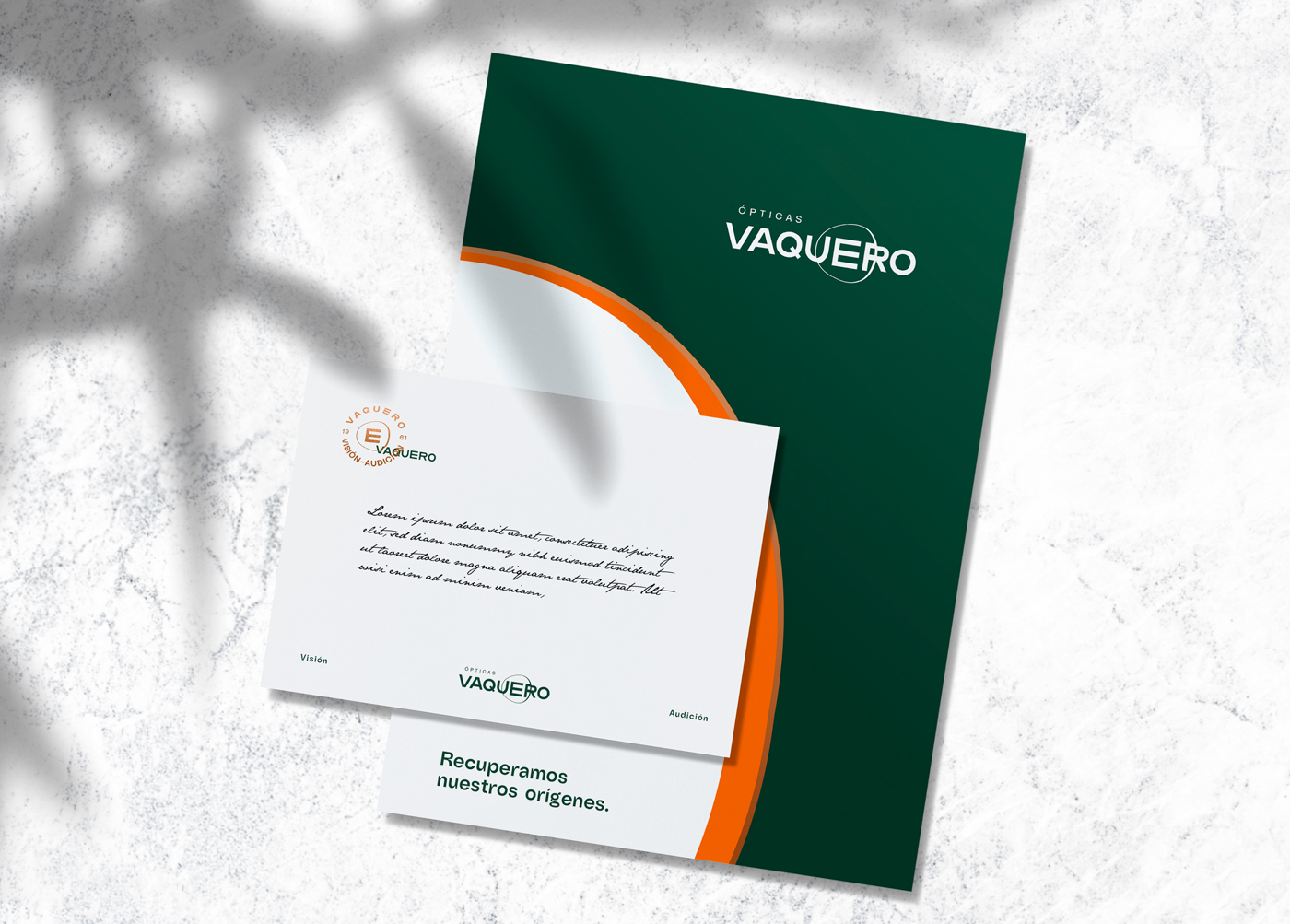
Ópticas Vaquero
Year
2020
What we did
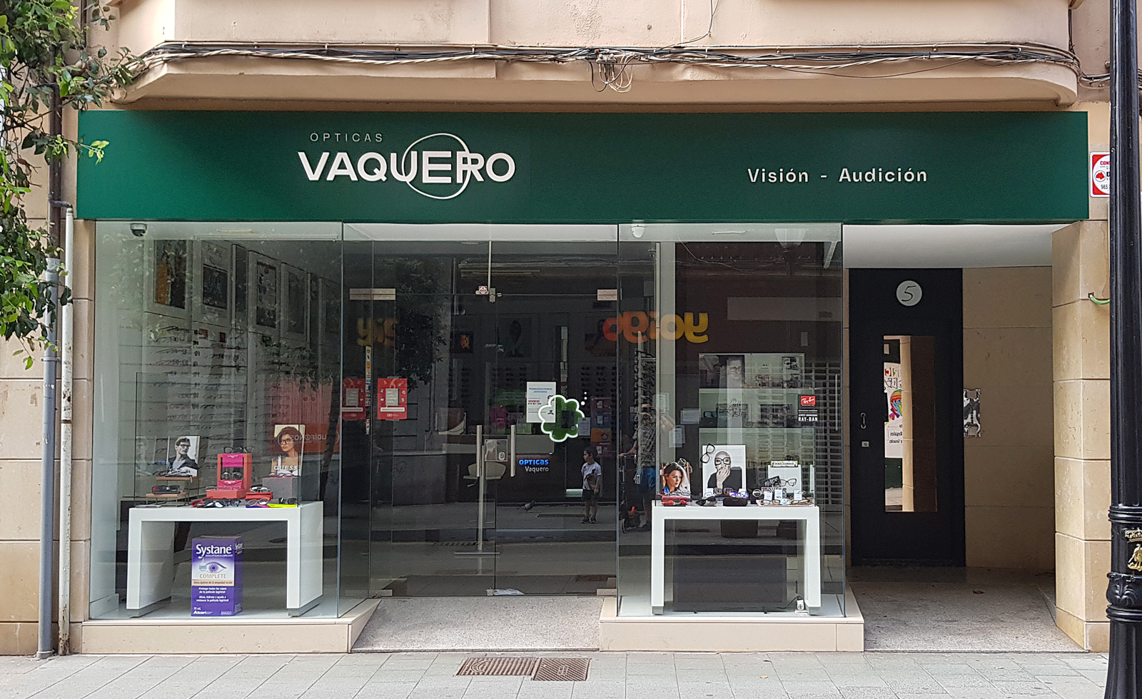
- Visual identity
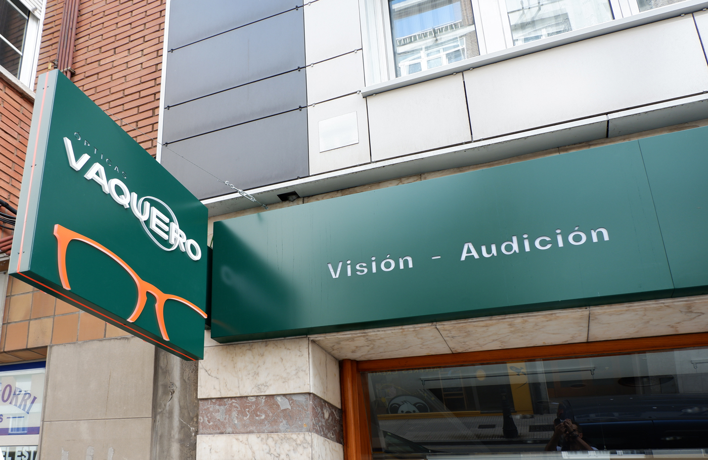
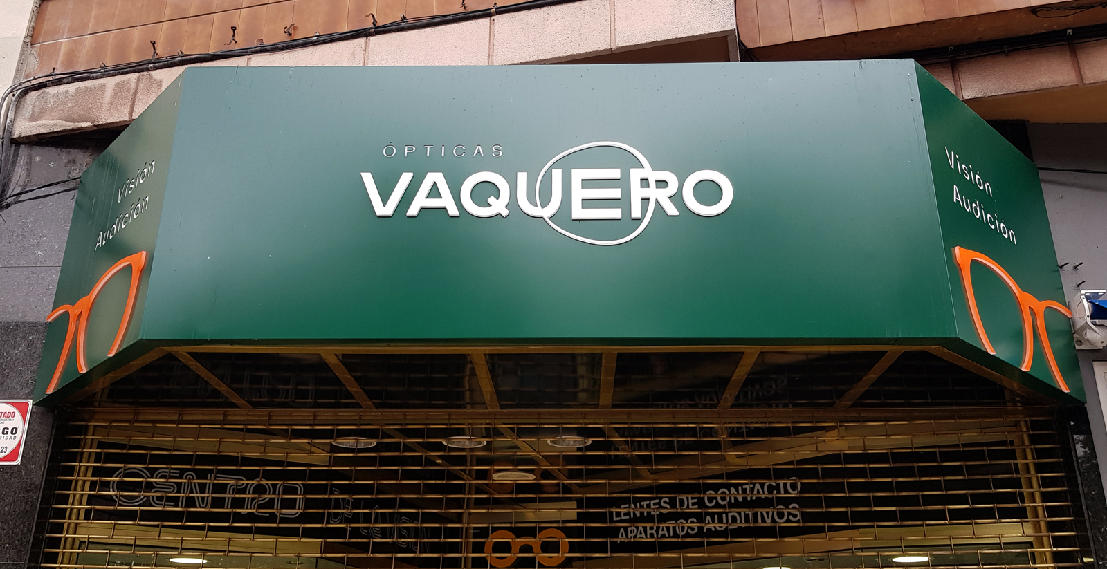
- Signage
- Luminous signs
Starting situation
Optical Cowboy is a group optometric reference in Gijón. He was born in 1961 in the hands of Alfonso García Vaquero, who along with their children, opens the 5 points that make up the group today.
A prestigious company, always focused on the innovation and new technologies, specialized training of their workers, and a deal with the customer focused on getting the maximum satisfaction.
These objectives were the same as those pursued by the group Multiópticas who founded together with several partners, although these values were diluting with time under a directive interested only in profits.
Cowboy is forced to leave the group Multiópticas to keep their values, this leads him to create a new identity from scratch, that should compete with the powerful franchise that coexist in the market of the optics.
Services offered:
– Advice and service specialized in everything related to visual acuity and hearing.
– Products with a good price-quality ratio, designs of top brands.
Problem
Factors that can directly impact sales.
– The large chains continue to gain market share, dominating 45% of the industry sales, which surpassed the 2,500 million euros in 2019.
– The optical separate account for 17% of the sector and, according to forecasts, its presence will continue to decline, “The optics are not integrated in chains or may not work under the umbrella of a group of purchase will continue to lose market share.” Juan Ortín, director of the Observatory Sectoral DBK.
– To buy less quantity prices are higher.
– Smaller budget for marketing.
– The e-commerce or sale in the Internet.
– Advances in laser surgery.
– The damage caused by the china effect.
Brand strategy
The big chains based its strategy to lower prices and great discounts, optical separate opt for the proximity, a clinical care professional for personalized advice and follow-up after-sale right.
The service is our greatest asset, therefore we need to reflect critically on issues of clinical, scientific, ethical, social, and economic involved in the professional practice of Optometry, to provide new solutions to our customers.
Increase the focus on service, taking measurements, graduation, choose frames, crystals, further adjustments, maintenance, after-sale...
For the purchase of product will be required for the association with co-operatives or associations independent.
Possible investment in eyewear design are exclusive, produced in spain, and processes more sustainable, organic materials, etc
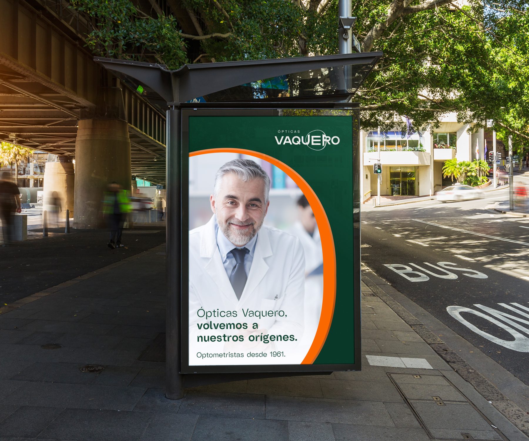
Creation of a marketing campaign that allows to unveil the new brand and to create an annual strategy.
We will work on the concept of “reclaiming our origins.”
The brand must speak of honesty, closeness, and an exquisite clinical care.
Experience, Quality, customer focus, Innovation.
Inspiration
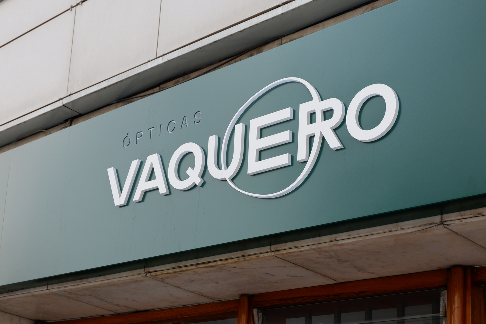
The logo is inspired by the typefaces and symbols used in optometry to measure visual acuity.
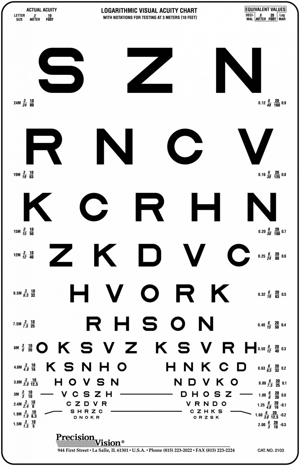
To the right of the chart LogMAR, which consists of 10 letters, was developed at the National Research Institute of Vision of Australia in 1959 by Louise Sloan.
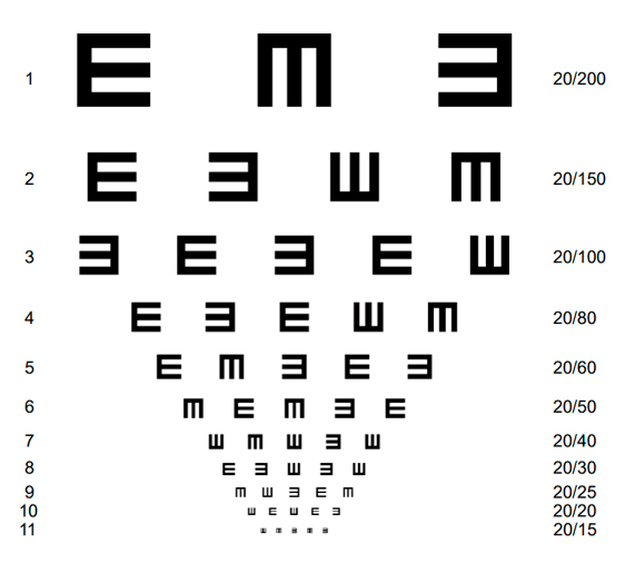
On the left panel of optotipos And Snellen, which is used especially with children who do not know their letters, in this way indicate the direction of the "legs" we adopted this symbol to replace And traditional.
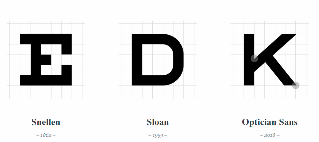
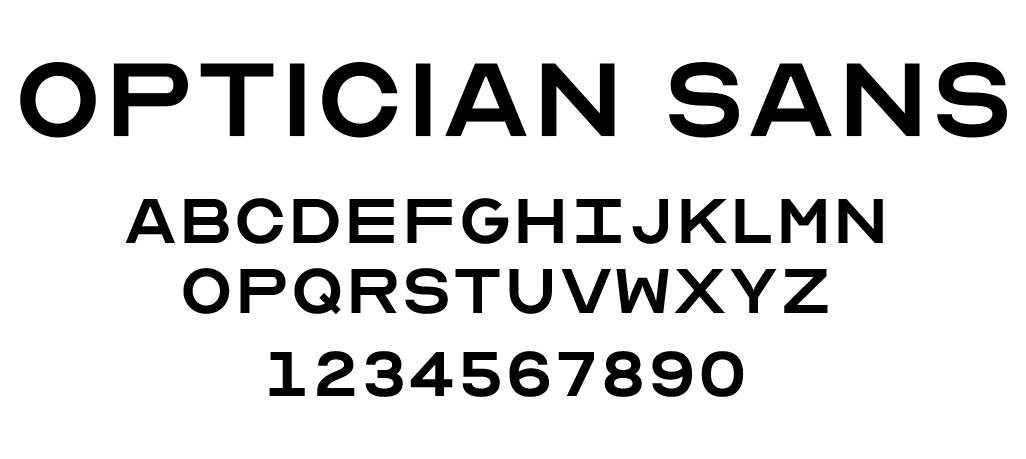
The font used in the logo is the Optician Sans based on the historical charts and optotipos Snellen and Sloan used by optical from all over the world.
To the left, group logo Multiópticas. To the right is the new logo of optical Cowboy after his departure from the group.
Color
The green represents hope and new life.
Is associated with health and peace of mind.
The darker tones, it means money, power and prestige.
As a counterpoint, we use an orange light, a synonym for enthusiasm, excitement and joy. It is used to attract attention.
Green English
Main Color
#124734
Pantone 3435C
Experience
Quality
Bright orange
Secondary Color
#FF6B00
Pantone 1505C
Innovation
Customer care
Typography corporate
With the objective of maintaining a coordination and typographical unit in all of the elements of corporate id, are set to use the same typeface to make the composition of all text information and communication of general use.
The use of typography is essential in this identity, we choose a typographic family moderna, with a character, you get a picture of differentiator.
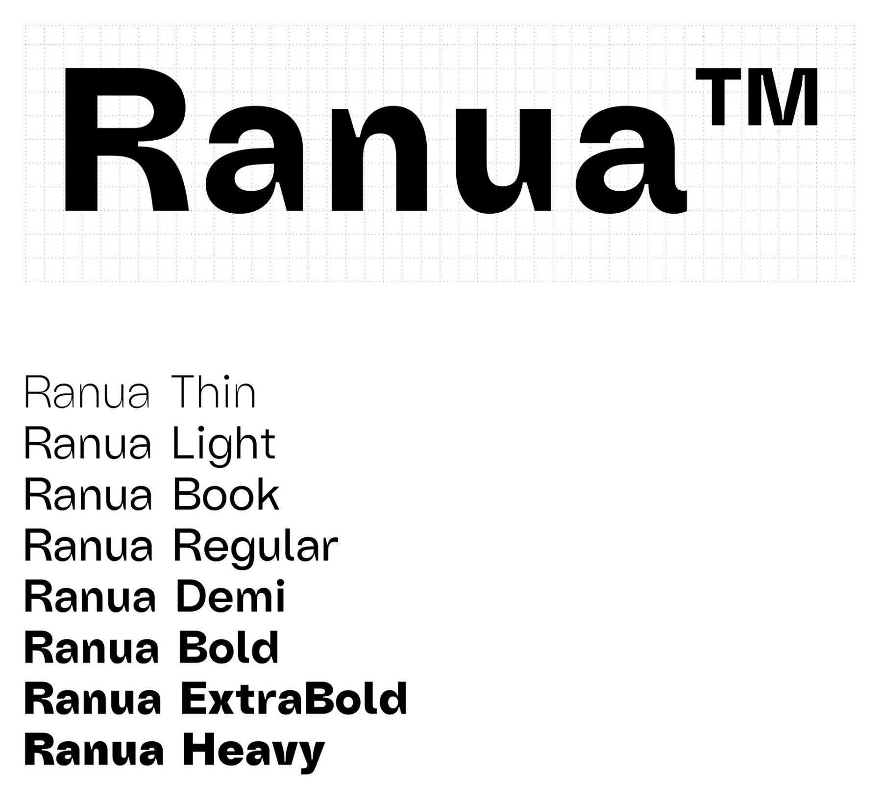
Ranua ™ is a typeface designed in 2019. Ranua has 8 different weights, including Thin to Heavy. Each weight of Ranua has over 550 glyphs that will help us communicate in different formats, on a screen or paper.
Ranua ™ is a typeface designed in 2019. Ranua has 8 different weights, including Thin to Heavy. Each weight of Ranua has over 550 glyphs that will help us communicate in different formats, on a screen or paper.
Graphic resources
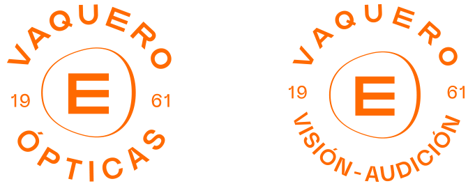
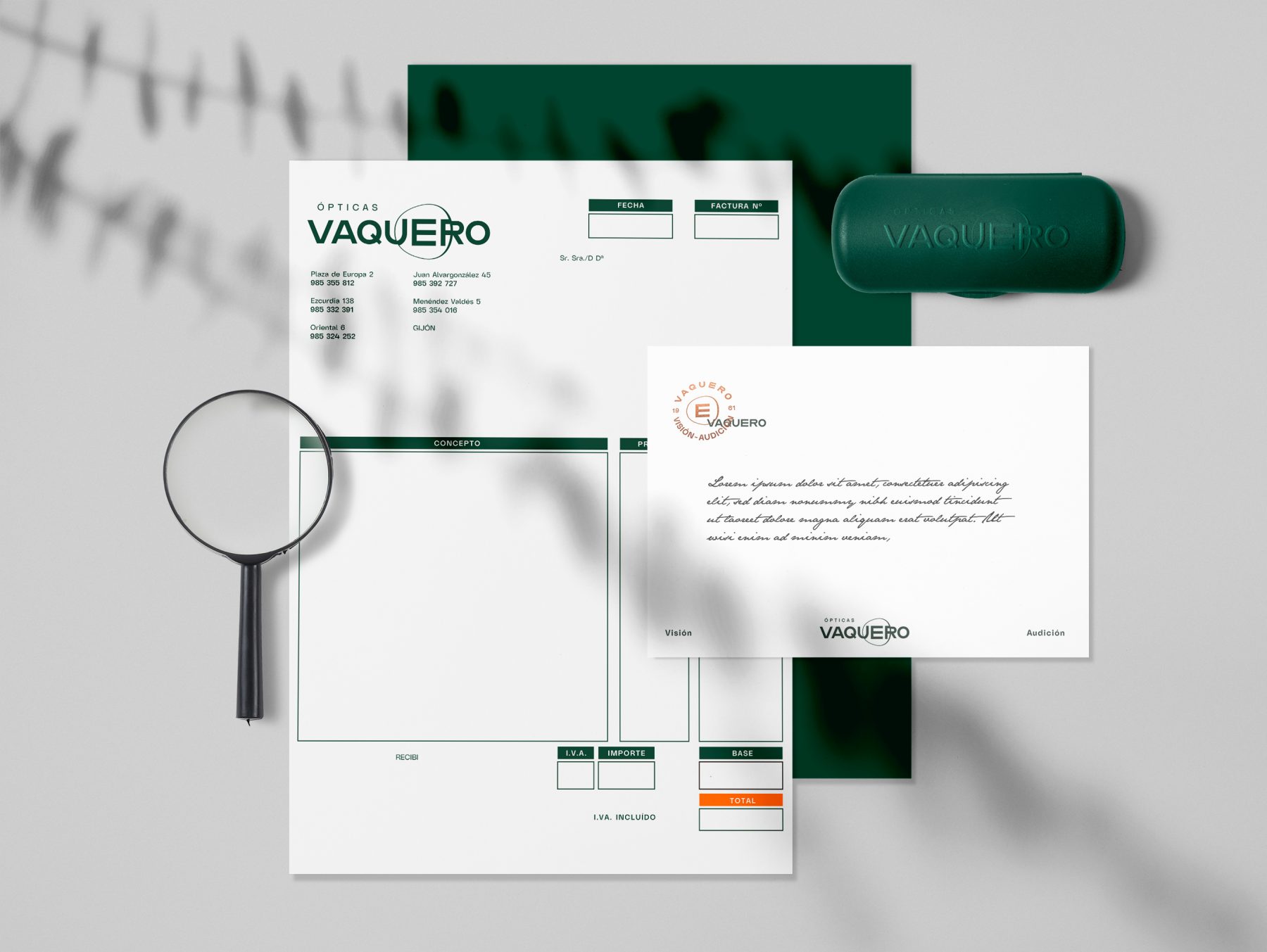
Seal
The seal has its origin in the sealing wax, a system that used a kind of wax to close a letter guaranteeing their authenticity.
In the seal it took to impress the family crest or the company.
Therefore their use has connotations related to the historical, exclusivity and luxury.
Lens
We use the lens of the logo as a decorative element in different ways depending on the applications.
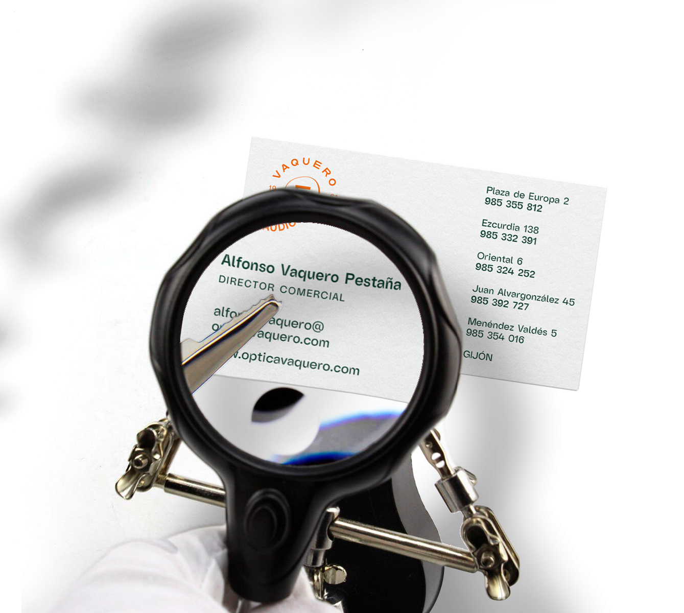
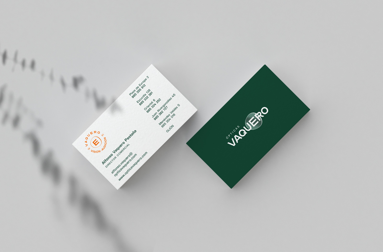
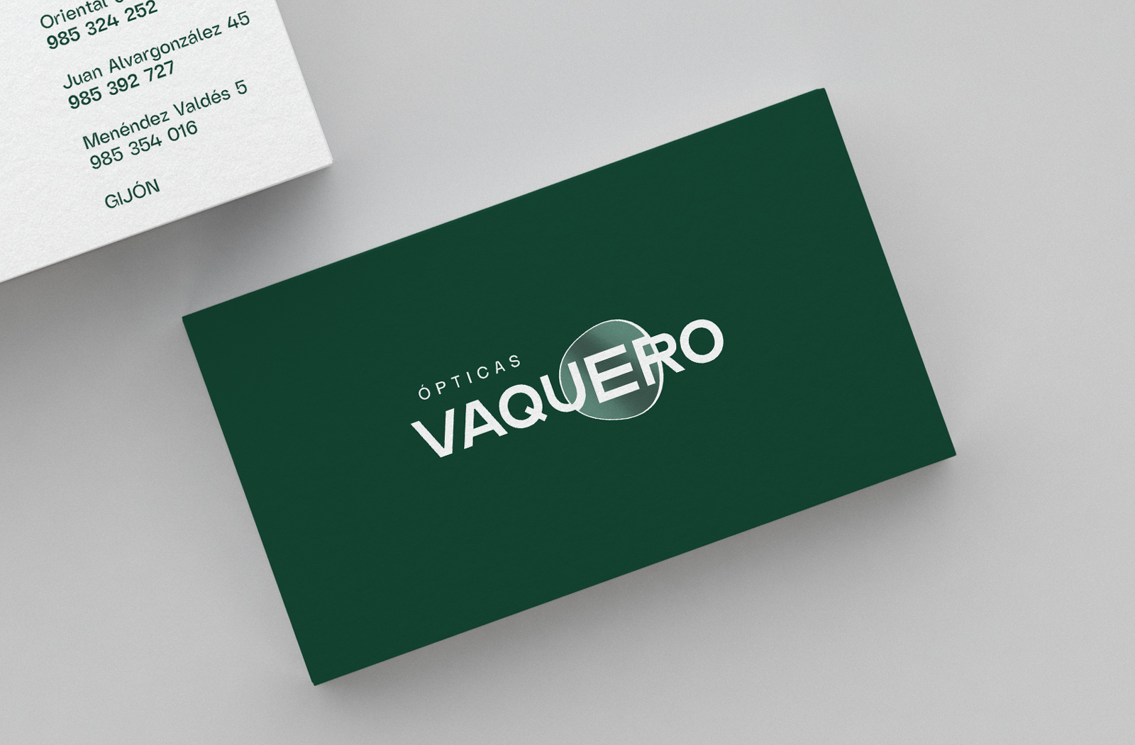
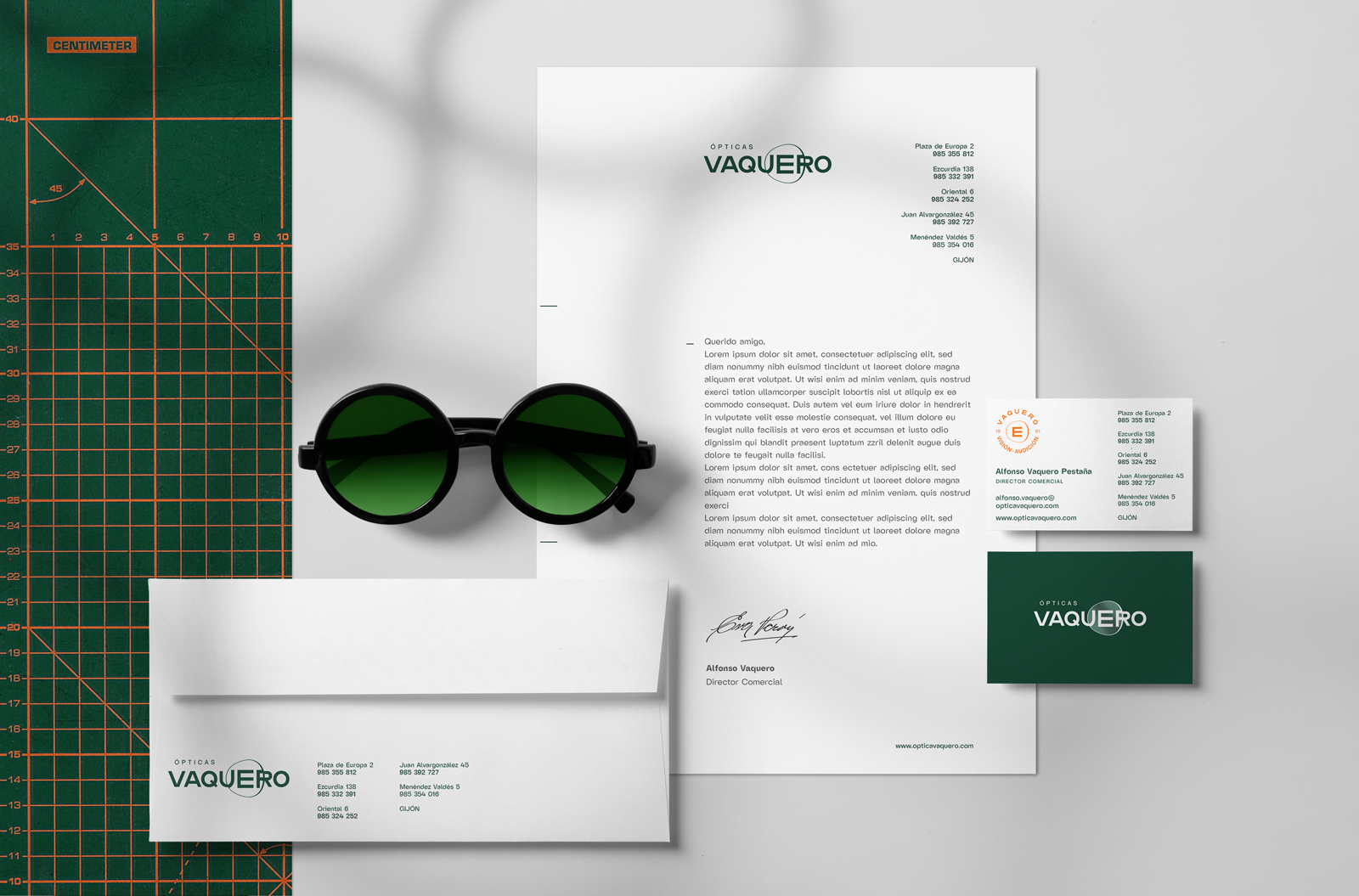
Business cards
We took advantage of the printing of the cards in paper to use a varnish UVI (a varnish-gloss with highlight) in the area of the logo that has the lens, we get a realistic effect amazing.
If you enjoyed this project, take a second to share it, thanks