


Factoría Cultural de Avilés
Ayto. Avilés
Year
2020
What we did
- Visual identity
- Booklet white Night
Introduction
The Factoría Cultural center is a public art, which encompasses disciplines such as ceramics, printmaking, painting, music, dance, photography and other digital arts.
Celebrates 10 years of existence in a restored building that was a factory shirts, although its flagship, the school of ceramics, he has completed 35 years of existence.
Celebrates 10 years of existence in a restored building that was a factory shirts, although its flagship, the school of ceramics, he has completed 35 years of existence.
- Their services are divided into:
- Training, with workshops for all ages, from children to older people.
- Artistic production, with 8 assists on the year for residencies.
- Rental of venues, rehearsals, workshops, etc.
- Networking with other cultural centers and schools at national and european level, and with the private sector at the local level, art galleries, dance center, etc
The main objective of The Factory is to create a multidisciplinary space, cultural and reflective, which facilitates synergies between artists, a hotbed of art and culture as a social good.
The brand should reflect that it is a living, dynamic and cheerful.
Target Audience
Your target audience is very varied so you should be shown as an inclusive centre, open to all ages and nearby.
We want your users (artists) to see the center as a place in which can learn from the best professionals, in which the level of demand will help you to improve. and they do so in an environment happy, welcoming, dynamic and informal, where they can openly express themselves through art.
Key factors of the brand: an Open, Contemporary, Collaborative, Multidisciplinary, Imaginative, Experienced.

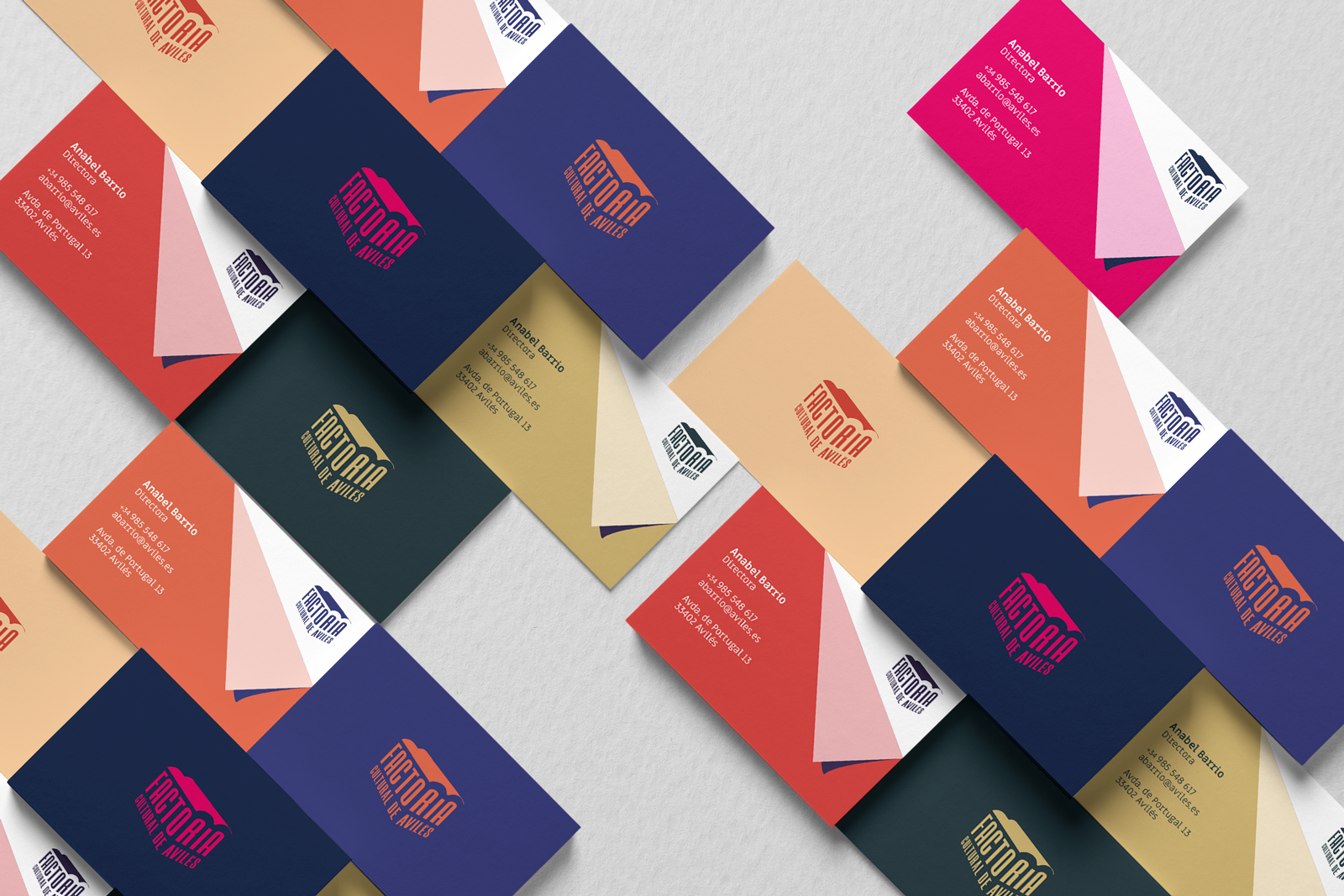
The design of the logo continues to draw inspiration from the ships of the building that houses the Factory, as did the old logo.
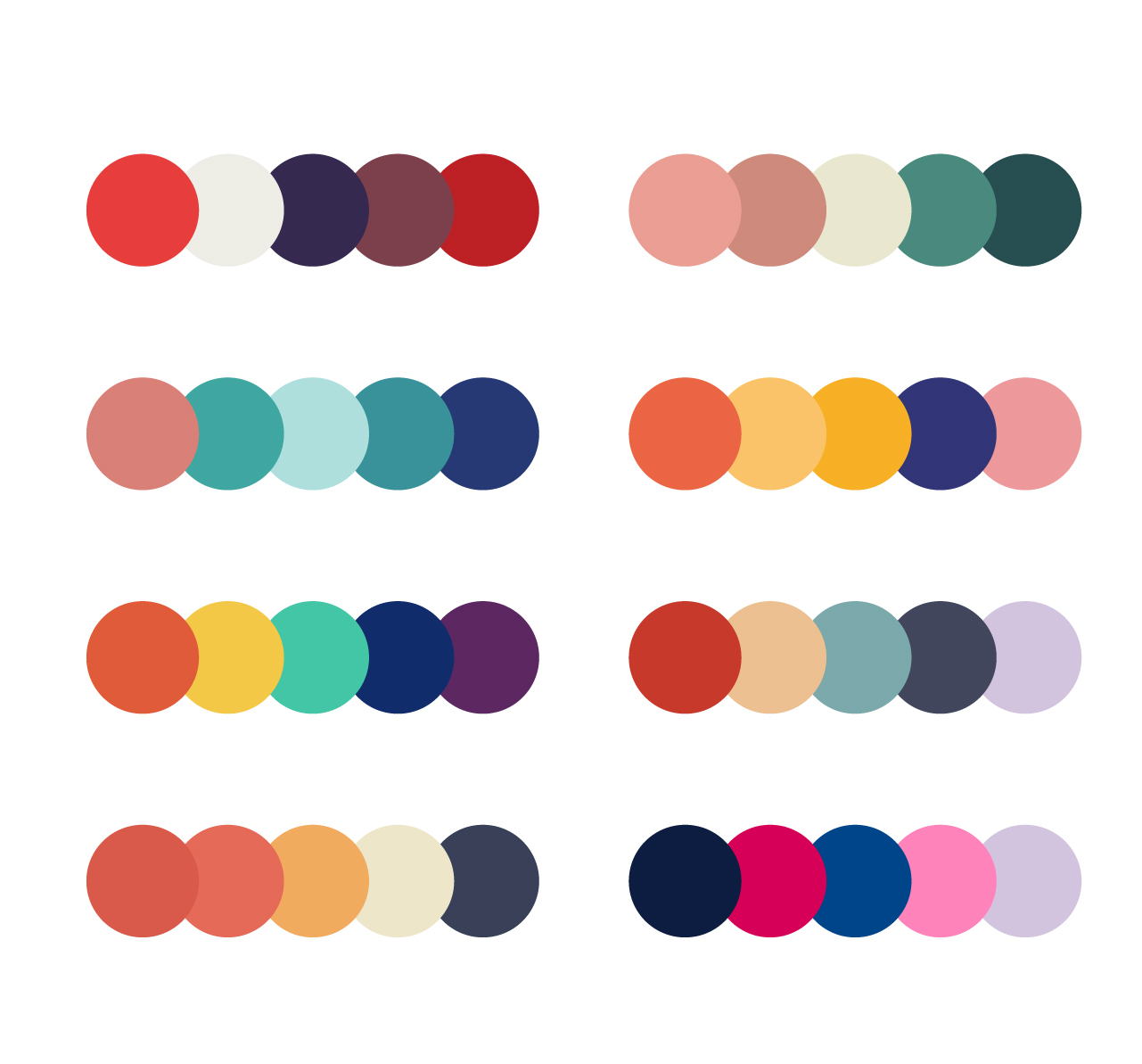
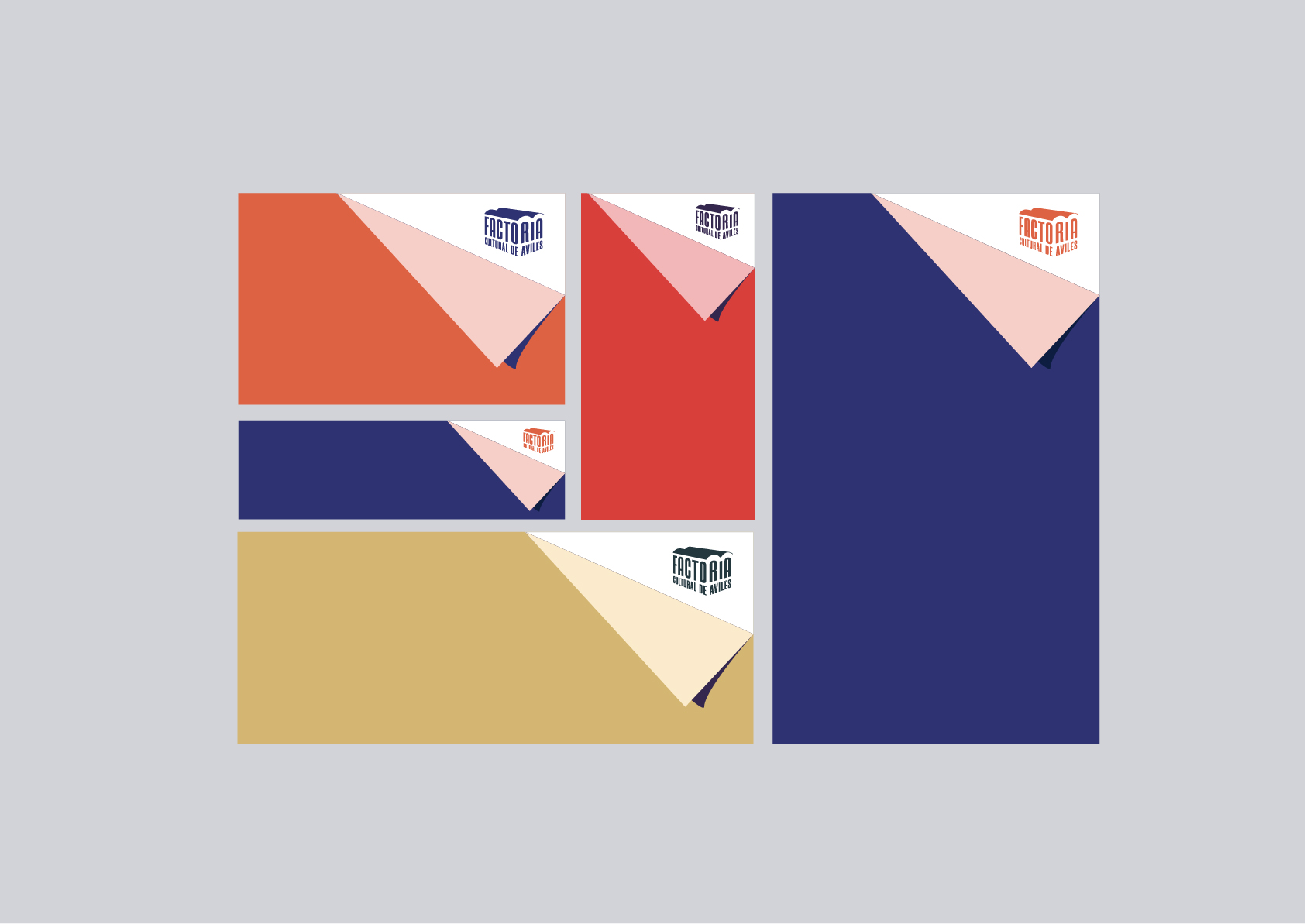
Color
We have not sought to color concrete, we wanted to use all of them, as a symbol of plurality, and multidisciplinarity. Here are some combinations that we are attractive, but are valid in the other.
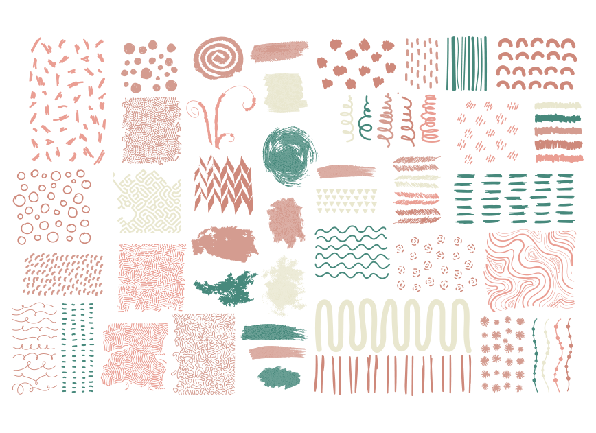
Graphic resources
We organized a workshop at the own Factory in which the participants, volunteers from different disciplines, created textures that then would be a part of the identity of the center, thus creating a link higher among artists and center, enhancing the feeling of belonging.
Typography
With the objective of maintaining a coordination and typographical unit in all of the elements of corporate id, are set to use the same typeface to make the composition of all text information and communication of general use.
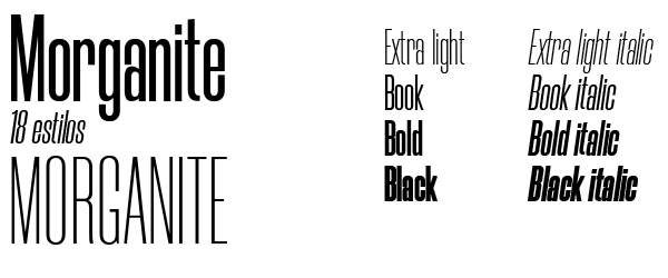
Morganite. (For texts descatacados and titles)
A font family of ultra-compressed and high that portrays strength and power. The characters condensed keep edges pretty squares to give a geometric and industrial to the source. The family is compatible with different languages and comes in 18 styles.
Morganite works great for headers, magazine layouts and posters.
Morganite is a family license-free:
Miriam Free. (For continuous text)
Miriam Free designed the israeli Michal Sahar is a family of fonts, mono-linear sans serif with two different weights, Regular and Bold. Despite its clean appearance, keeps original character only.
The smooth curves make it a source close to and friendly.
Miriam Free is a family of open source free download on google fonts:

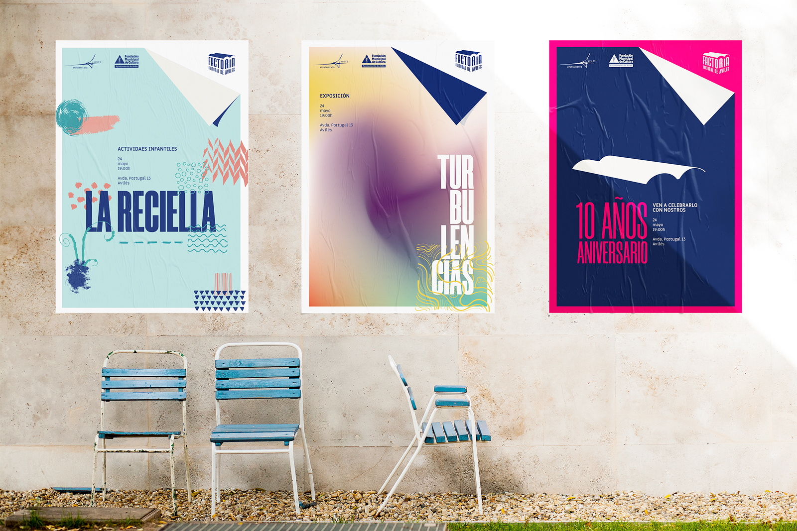
Signage
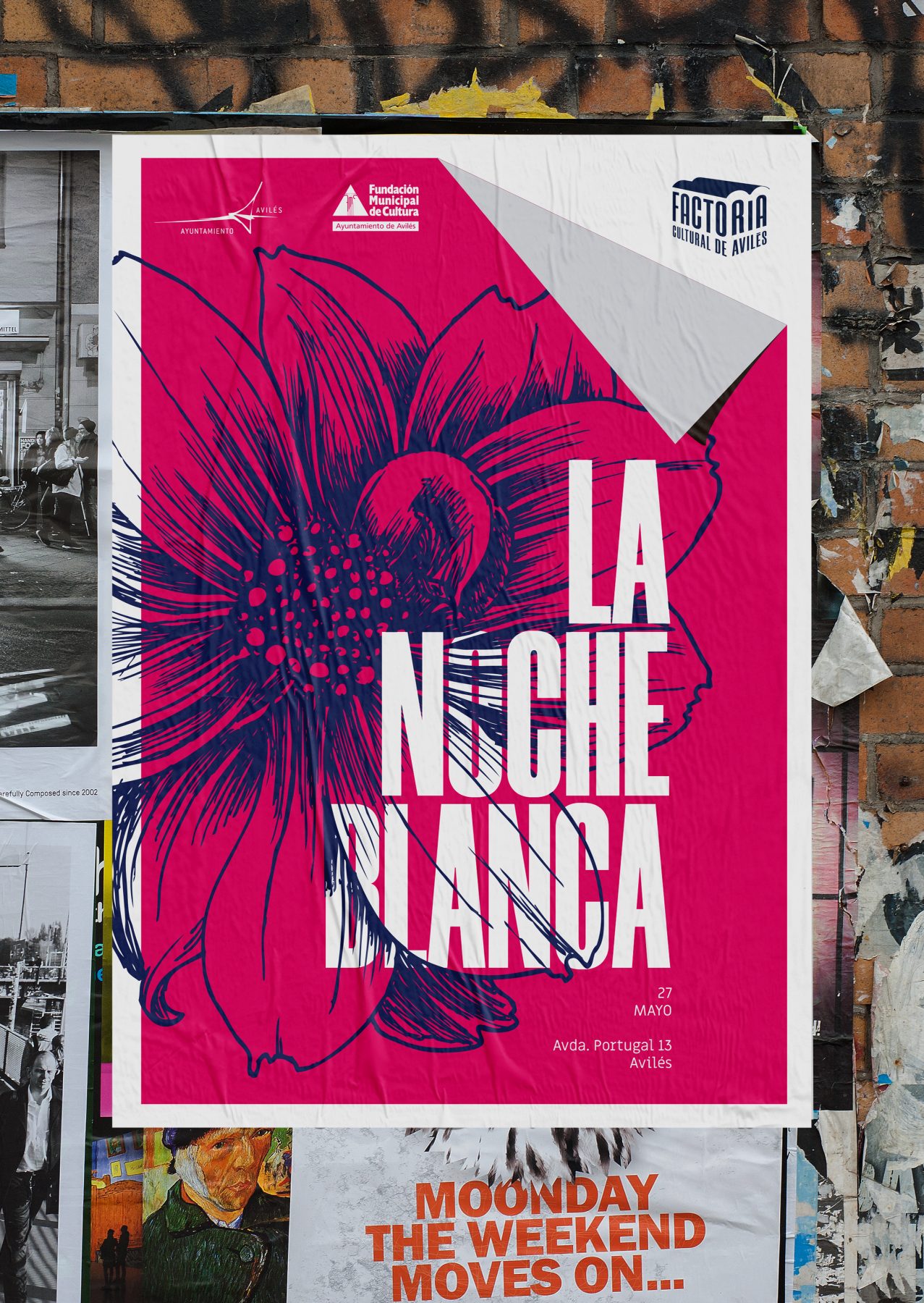
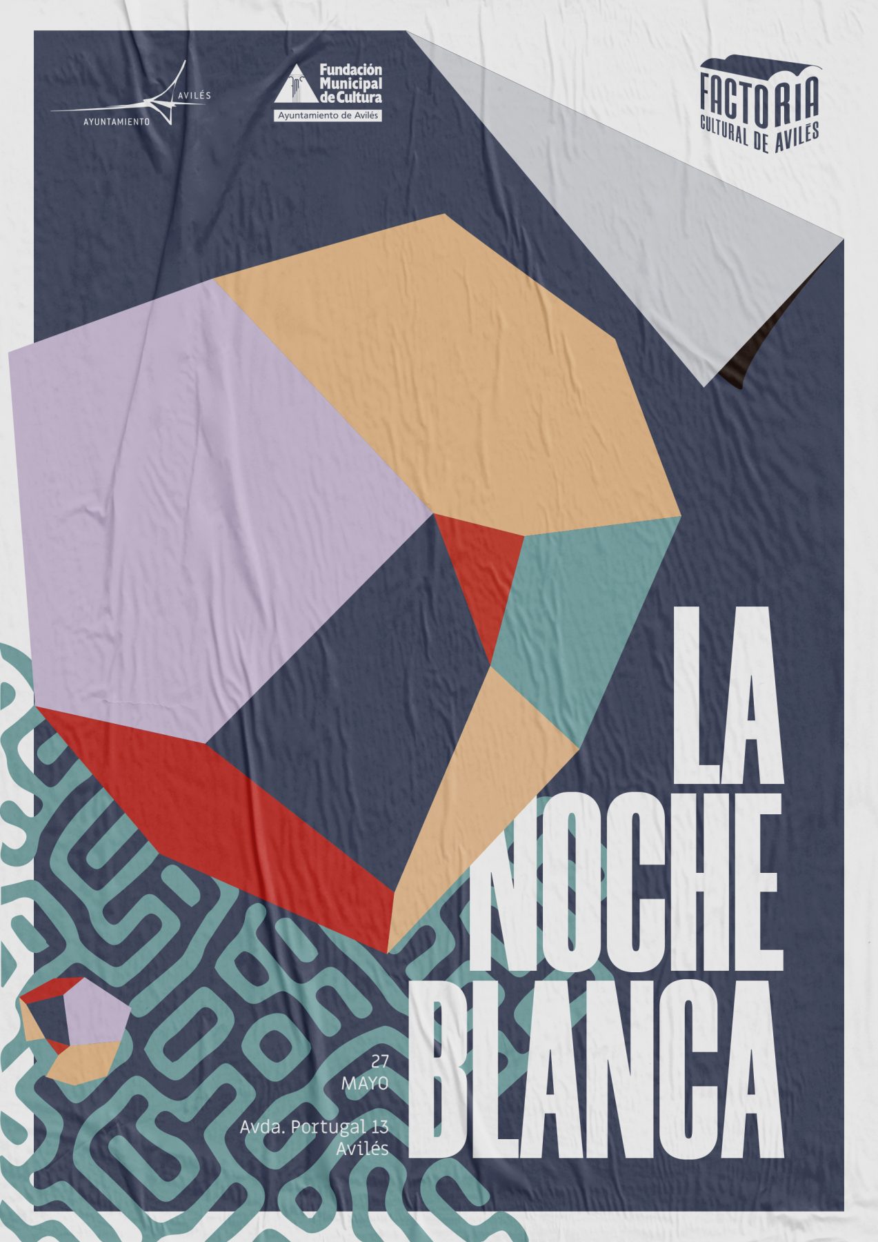
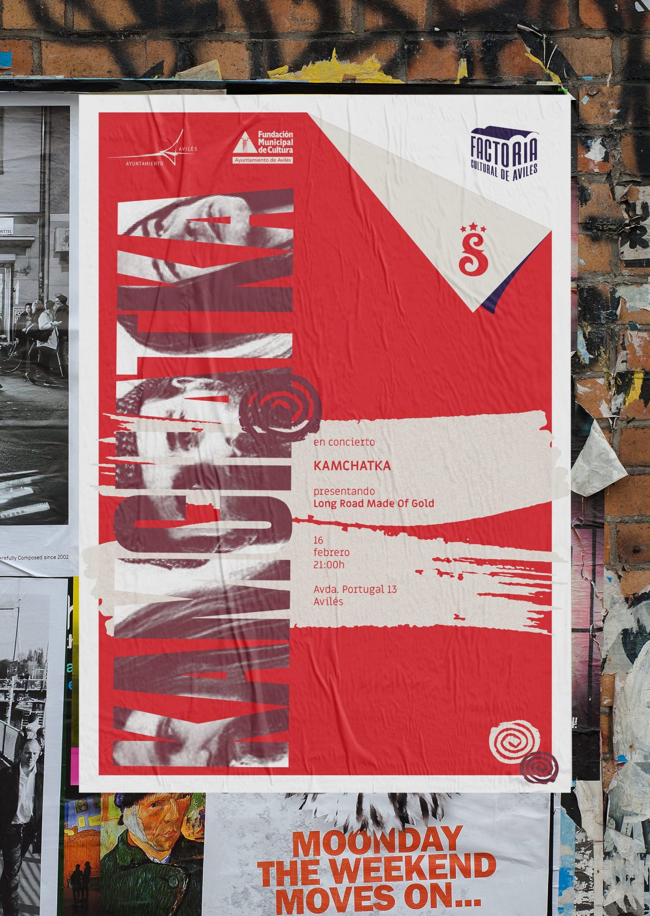
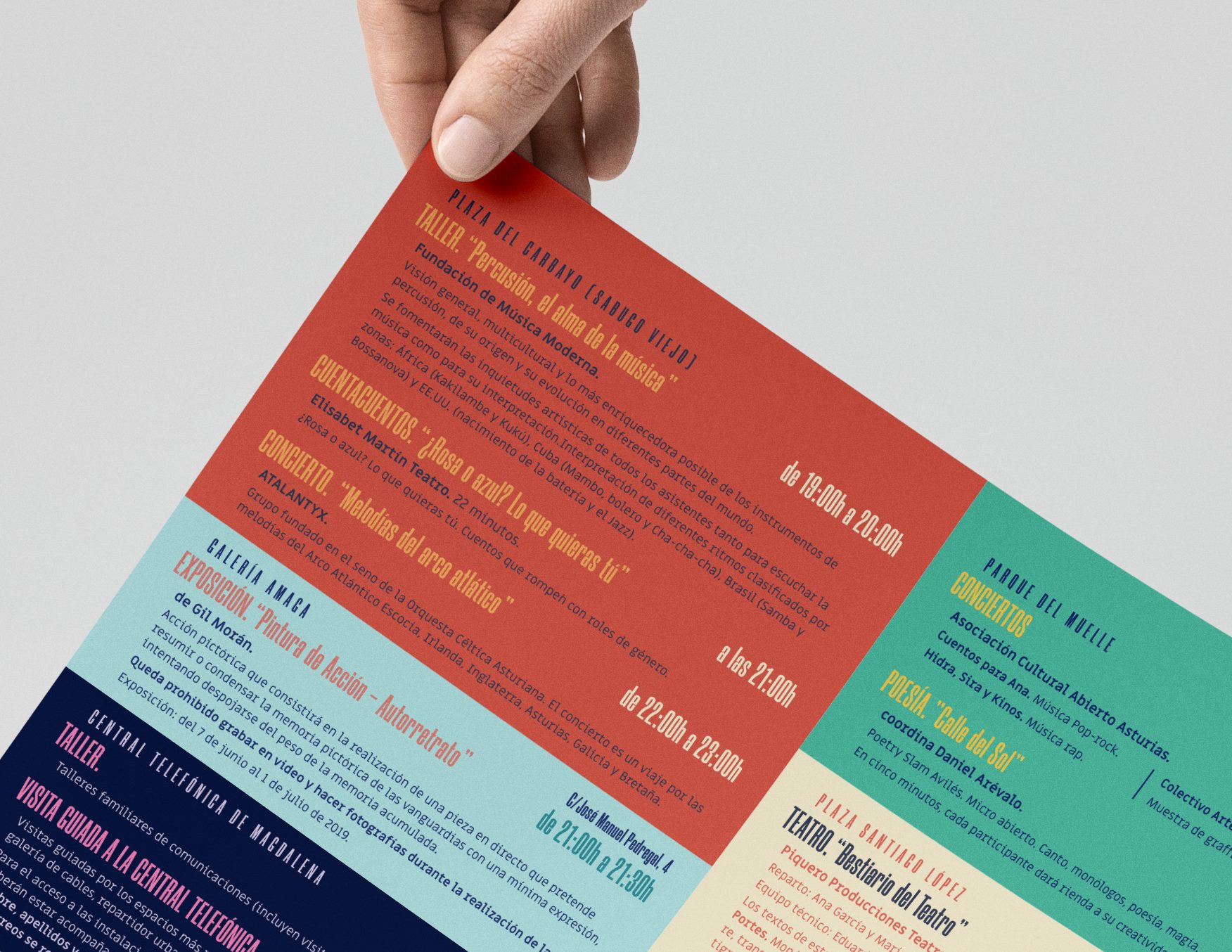
Another resource which helps us to define the brand of The Cultural Factory it is "the fold" its use is primarily intended for the design of posters. The events which are organized in the Factory are very varied, and the designs coming from different sources, we needed to unify them in any way, the fold allows you to see who is "behind all of them."
This graphic resource unifies and helps to identify the activities organized by the center.
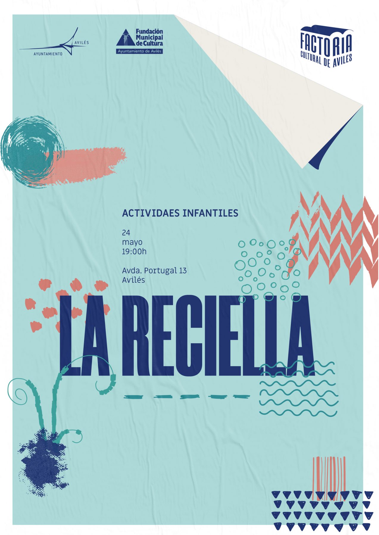
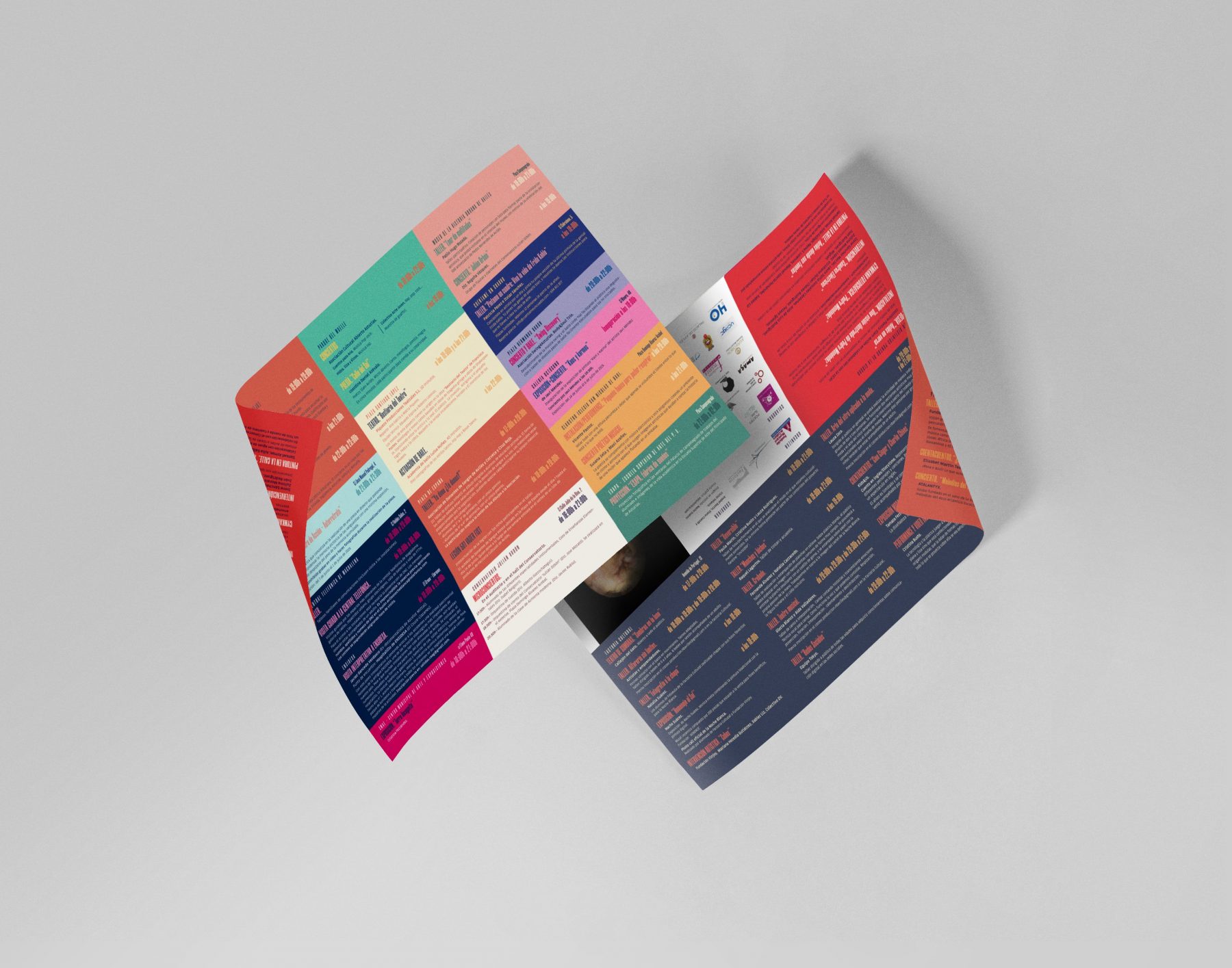
Brochure
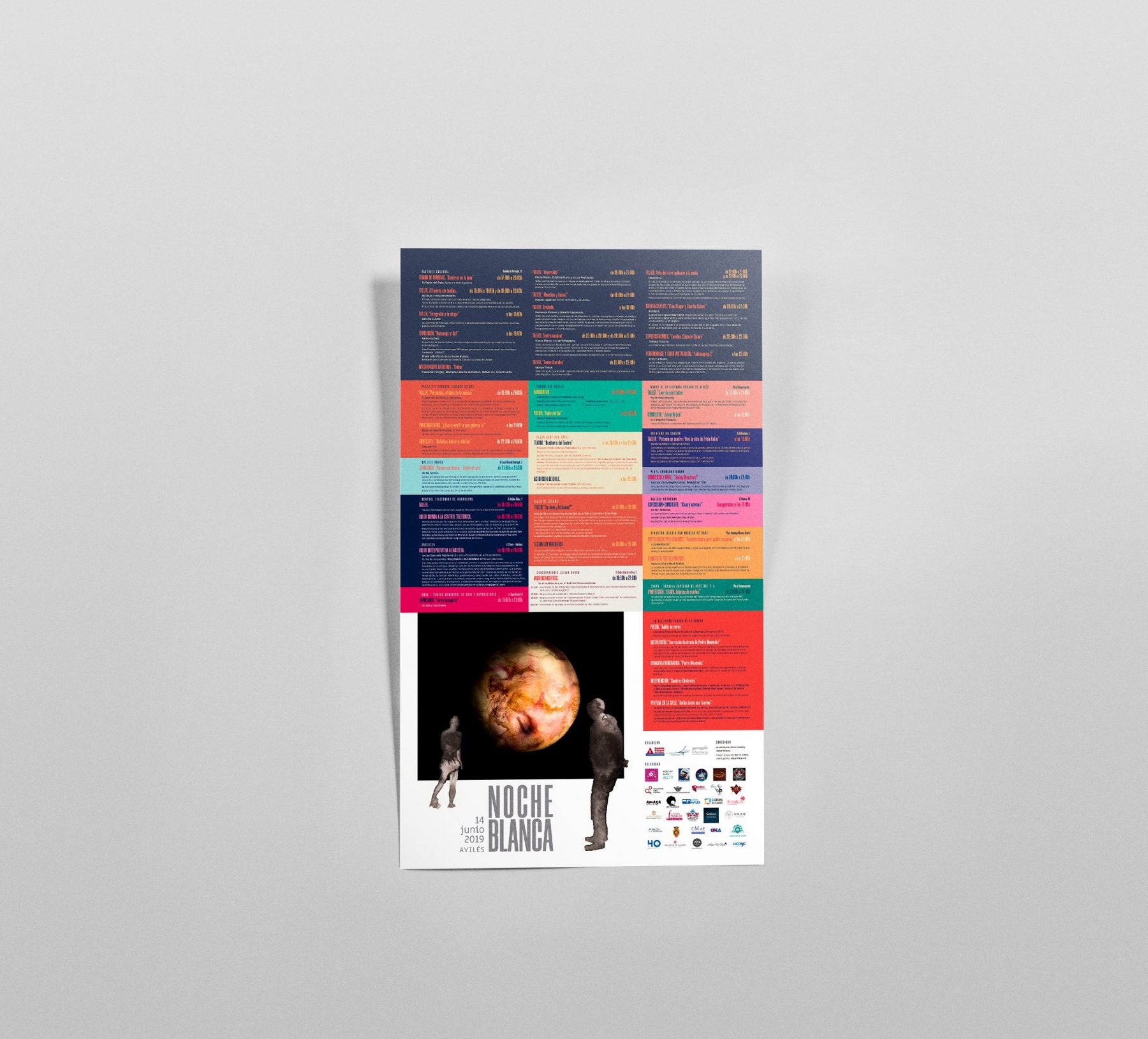
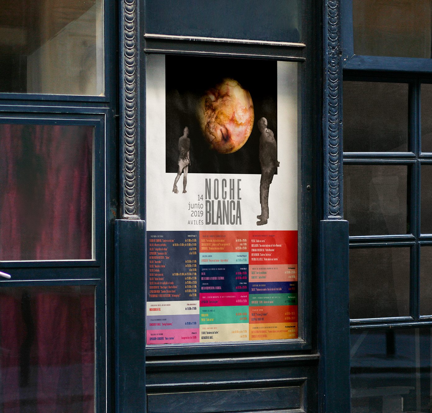
We design the graphic communication of the white Night of Avilés.
The main image of the event is carried out with the contribution of a work, in this case the artist Nacho Suárez.
For the poster design, graphic design should interfere as little as possible in the work and to give importance to the organizers of the event, and we the image with neutral colors using the empty areas of the piece.
We divide the program in the location from where you are to occur of the events, with a combination of different colours to each one, the result is eye-catching and calls to action.
The design was adapted to a variety of formats.
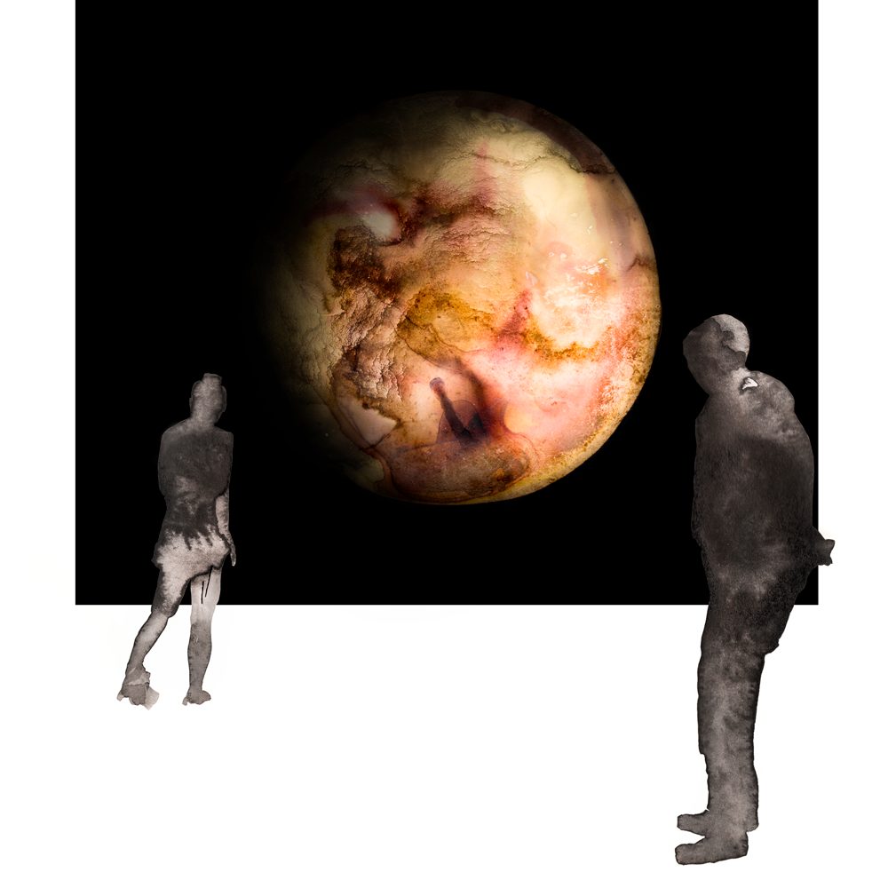
The work of the artist Nacho Suárez.

If you enjoyed this project, take a second to share it, thanks