


City of Oviedo
Red cross of Asturias
Year
2020
What we did
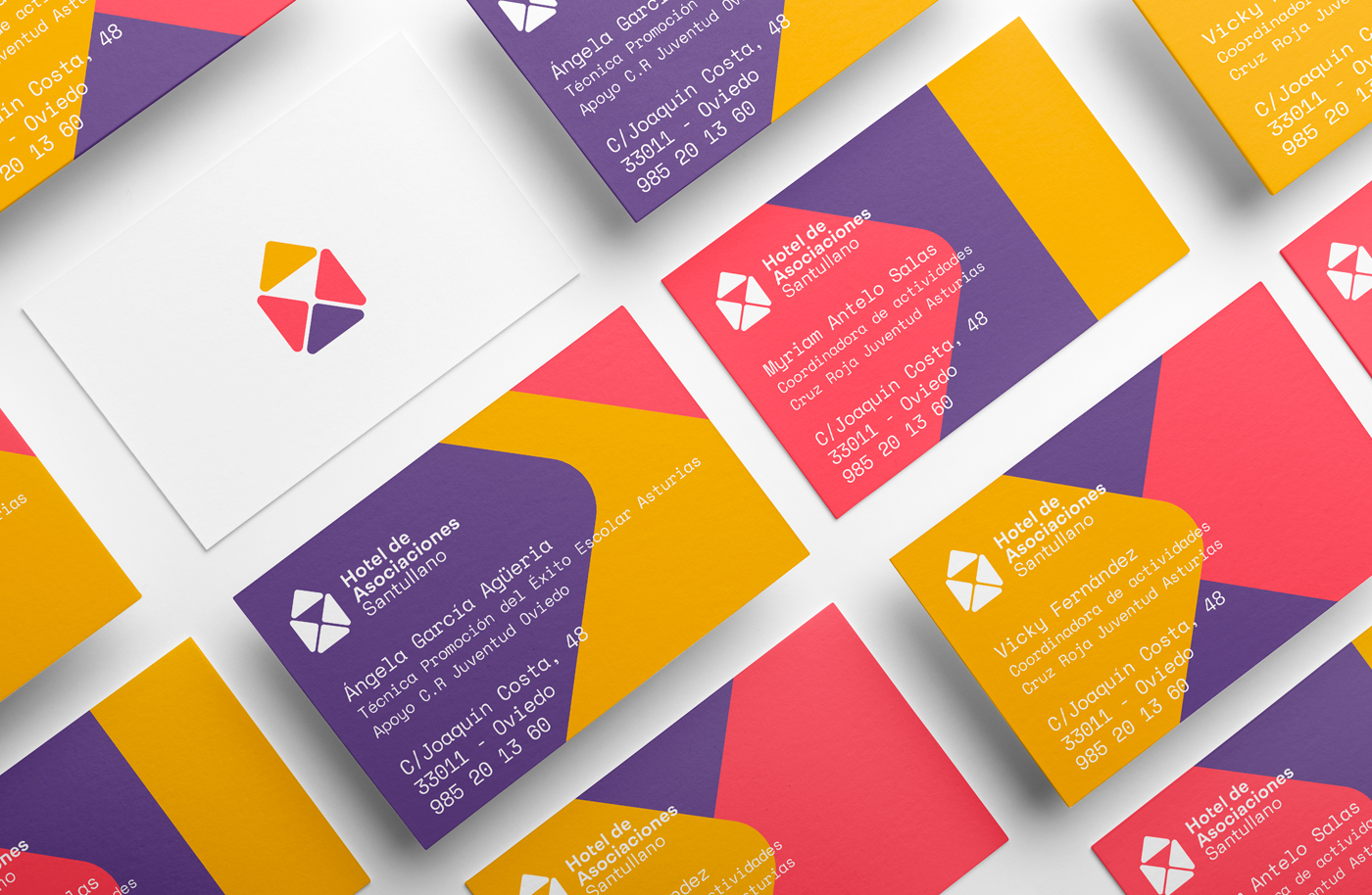
- Visual identity
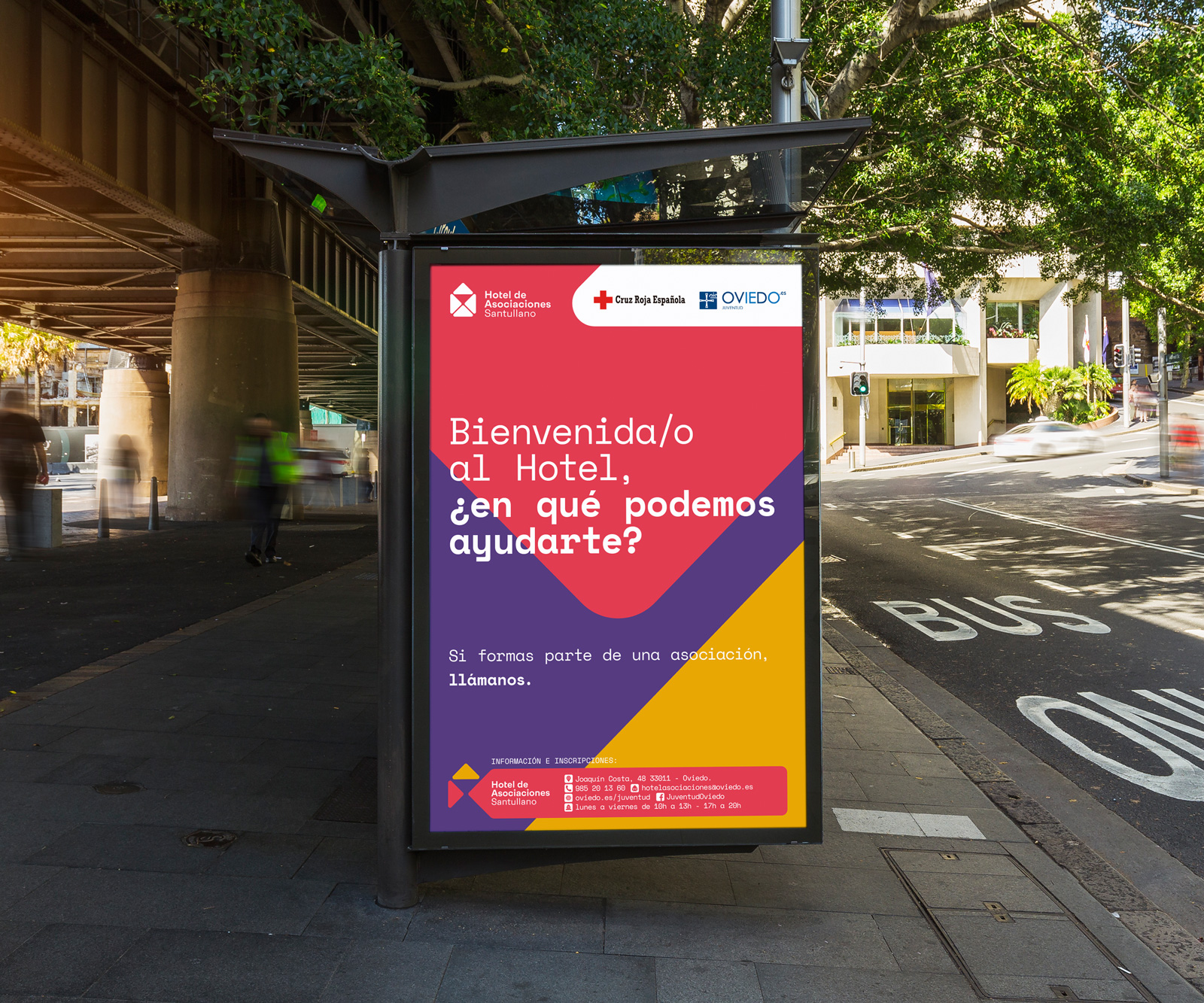
- Promotion marquees
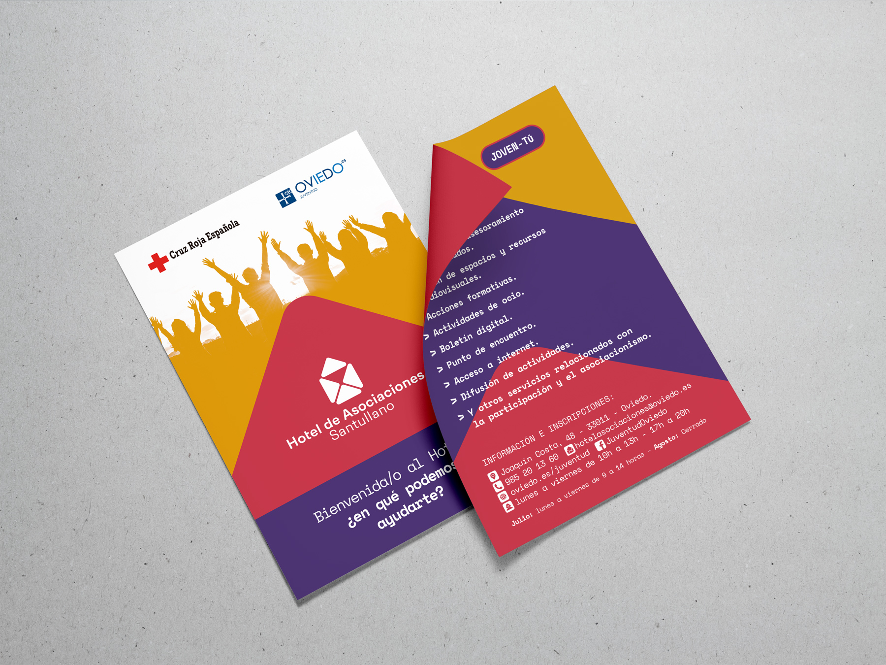
- Brochure
Introduction
The Hotel Associations Santullano is a facility whose goal is to support partnerships across different services such as the assignment of spaces and resources, advice and information, and the implementation of training activities and leisure.
Despite the great value of the platform, the analysis performed prior to the process of creating a brand yielded several conclusions strategic ignorance on the part of the population, and the users lack of a sense of community and belonging and their surroundings do not transmit the energy of the people who inhabit it.
The main objective of the Hotel is to support and empower the entities that lack them and serve as a meeting place and coordination, a multidisciplinary space, cultural and reflective, which facilitates synergies as a social good.
The brand should reflect the values of a living, dynamic, and collaborative.
Target Audience
It is very diverse, from the associations of people who make use of workshops and trainings, so that should be shown as an inclusive centre, open to all ages and nearby.
We want your users to see the center as a place functional and flexible, able to adapt to different circumstances in an environment happy, welcoming, dynamic and informal, where they can openly express themselves and learn.
Key factors: flexibility, meeting, collaboration, agility, proximity, social and plural.
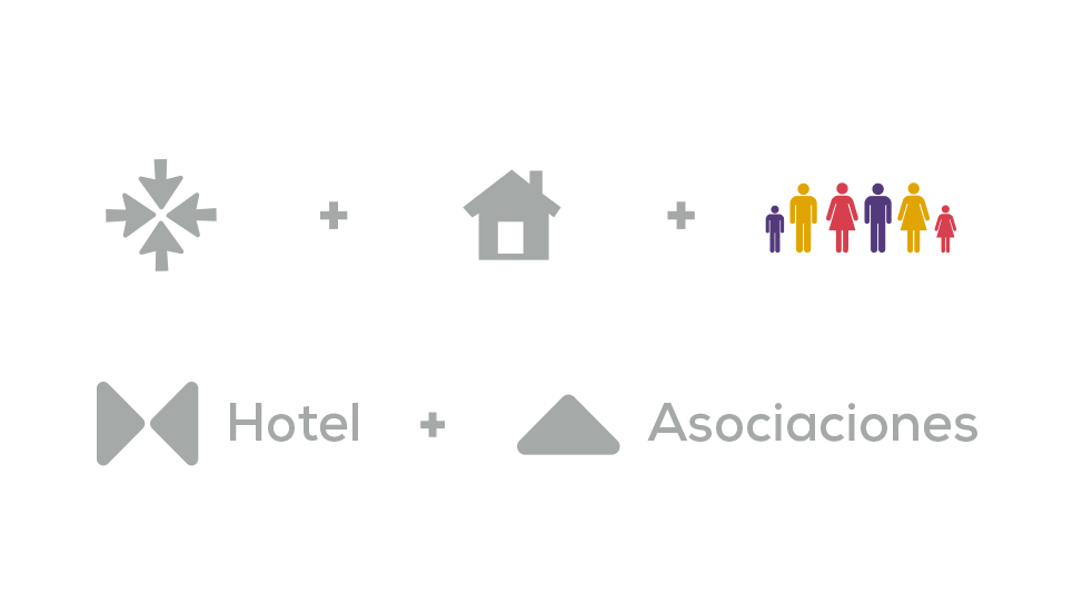
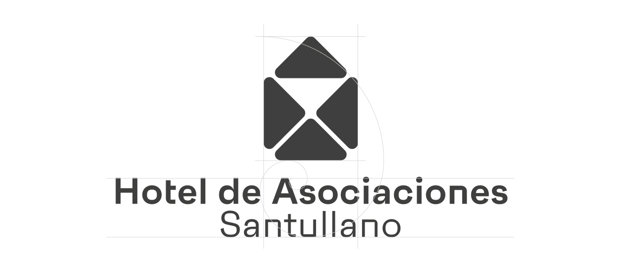
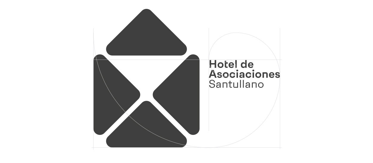
The design is inspired by 3 factors:
- Meeting, collaboration, arrows that are directed to the center as a metaphor of the meeting point.
- The image of a house, a Hotelas a reference to the values of the host, in addition to that defines the own name of the initiative.
- Plural, inclusive, and tolerant. The use of color as a predominant note of the brand reflects the variety of the target audience for the project.
We also used basic geometry to form the initial letters of Hotel Associationsthe H and A, as a visual reminder.

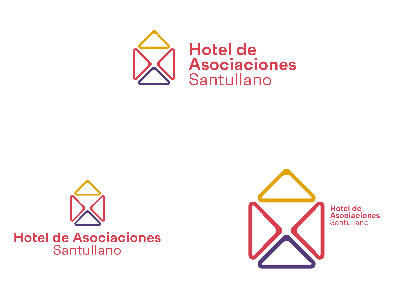
Versions Echo
The ink of the printer is one of the liquids on the most expensive in the world, to optimize the design of logos abaratamos costs in production of large print runs.
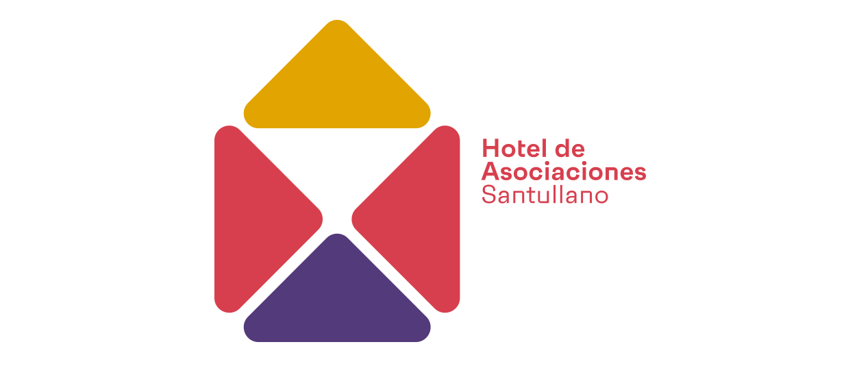
Color
The color will be a symbol of plurality and diversity.
We have chosen 3 colors able to collaborate with each other.
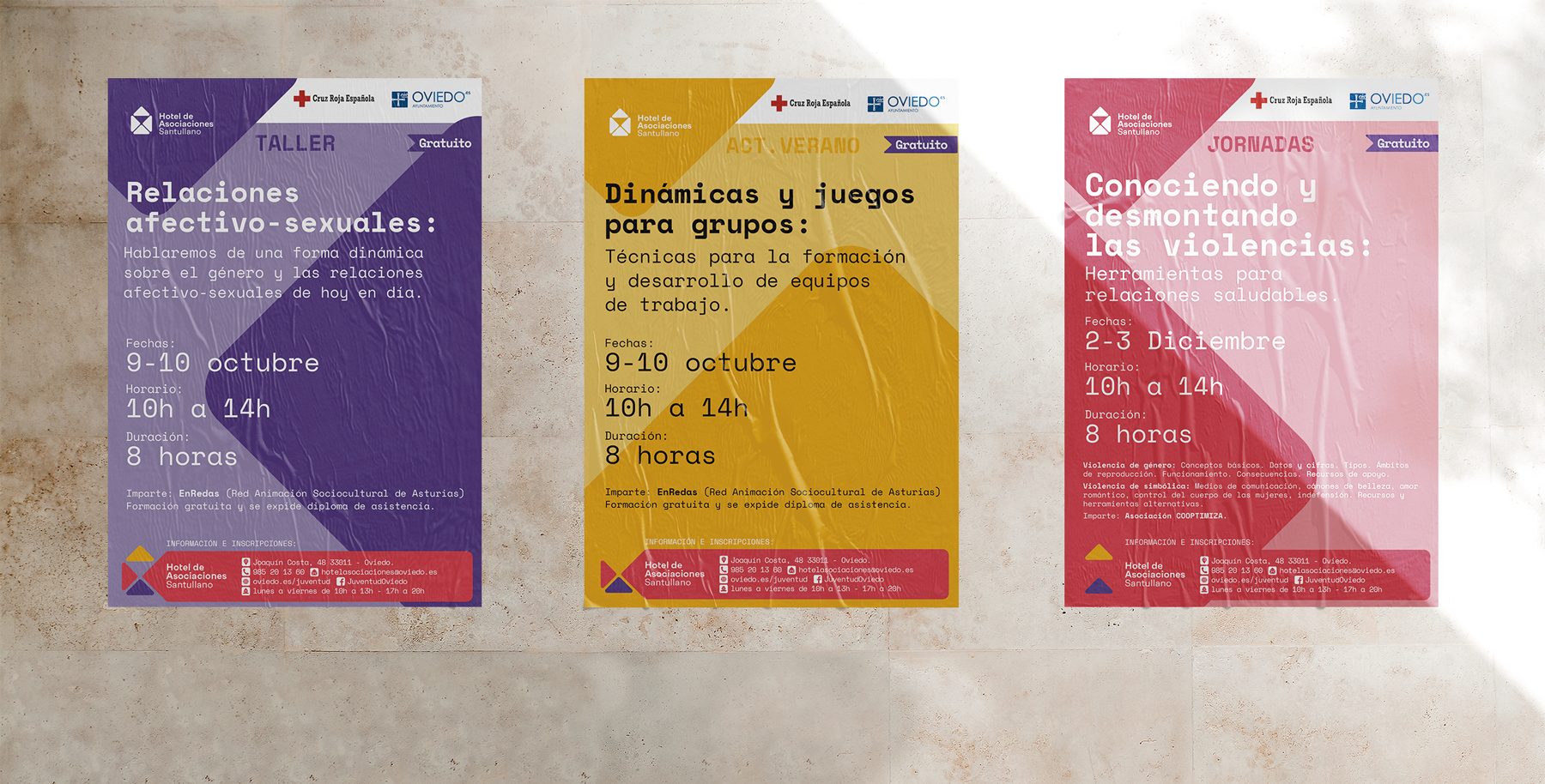
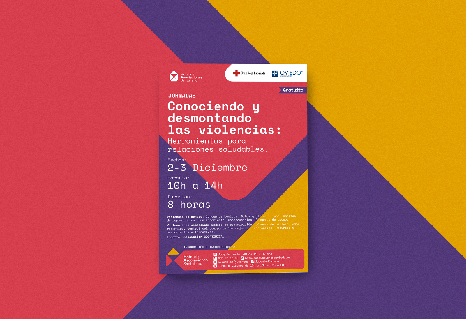
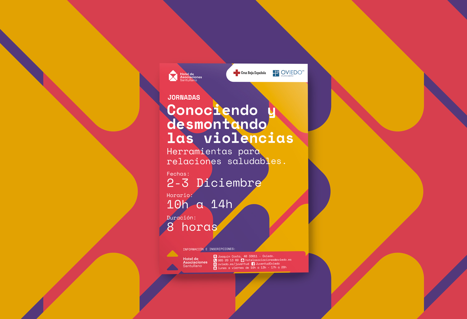
The colors are used to represent each one of the three principal themes of the Hotel:
- Summer activities
- Days
- Workshops
Yellow
Summer activities
#EBA900
Pantone 124C
C12 M40 Y97 K0
Red
Days
#E53E51
Pantone 710C
C8 M92 Y62 K0
Purple
Workshops
#573C81
Pantone 7679C
C81 M90 Y24 K0
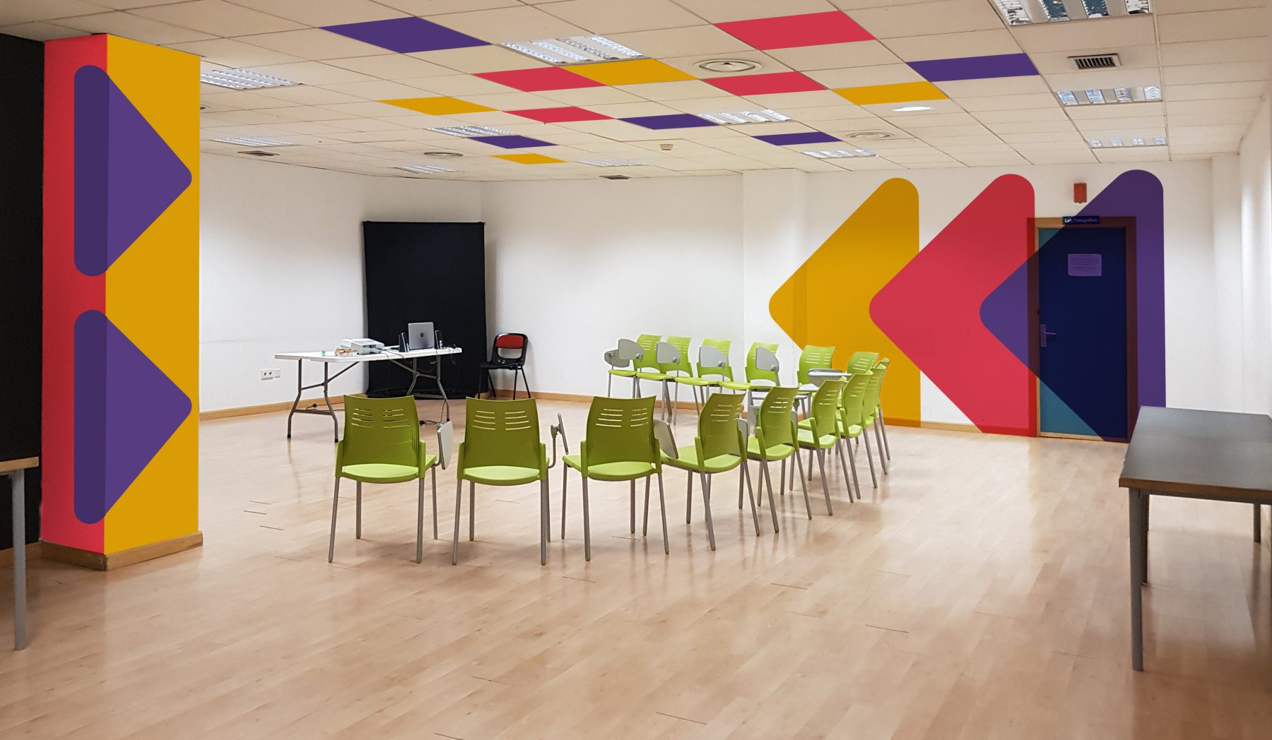
Graphic resources
The geometric shapes of the logo to act as a visual resource to enrich the identity.
Use with total freedom, combining them to our taste.
We can do abstract shapes or use your geometry to enhance the figurative meaning of a sign.


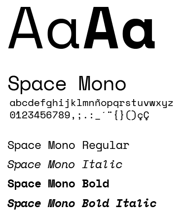
Typography
With the objective of maintaining a coordination and typographical unit in all of the elements of corporate id, are set to use the same typeface to make the composition of all text information and communication of general use.
The use of typography is essential in this identity, we choose a typographic family moderna, which is nearby and you get a picture of differentiator.
Space Monkey has open source license in order to avoid additional costs and is available at canva.com the software that is used in the Hotel for the creation of posters.
Typography geometric allow for an easy reading, image, giving it a clean and direct, to all the public. We choose Space Mono by its recognizable features.
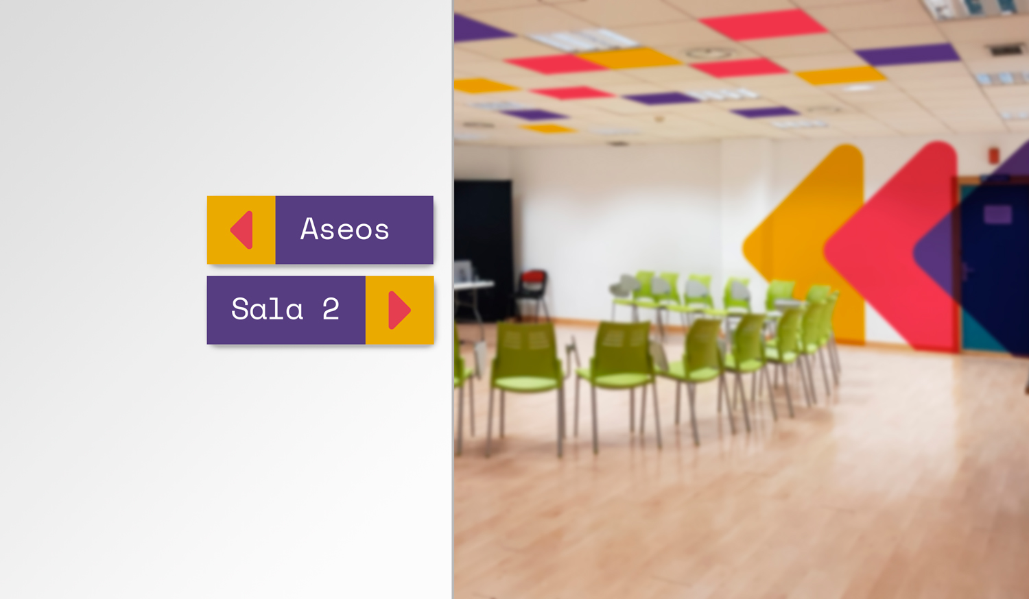
Signage
One of the means by which further communicates the Hotel is the signage, is designed and produced in the Hotel itself, so that it was necessary to create a style visually appealing and easy to use, plus a guide to the design to maintain a consistency in all communications.
As explained before, the color is used to represent each one of the three principal themes of the Hotel:
Summer activities, Days and Workshops.
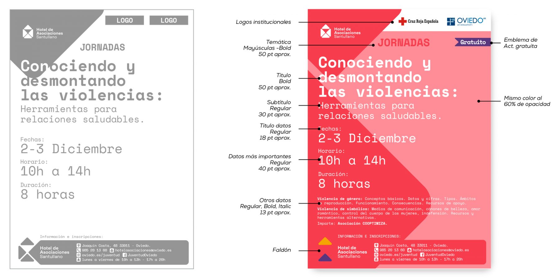
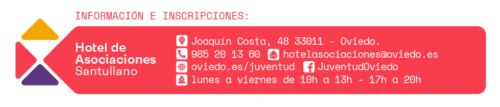
Skirt
The skirt contains all the contact information of the Hotel, has sought to occupy the least possible space. Will appear at the bottom of all the posters.

If you enjoyed this project, take a second to share it, thanks