


Gijón Impulsa
University of Oviedo
Year
2018
What we did
- Visual identity
- Design Offices
- Video for the launch event
Introduction
The Media Lab are spaces of creativity, creation of digital projects, innovative and collaborative. Without a concrete definition, and closed, are home to some of the world's fields as journalism, design, art, digital, new technology, or engineering.
MediaLab_ will be a period of learning in which the university will work on design projects, communication and humanities, through the use of technologies of industry 4.0.
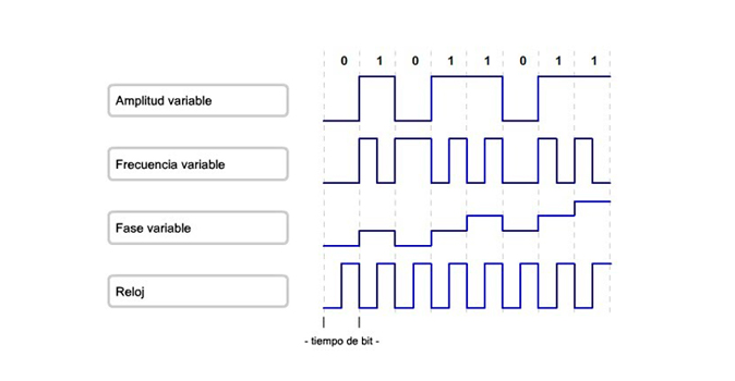
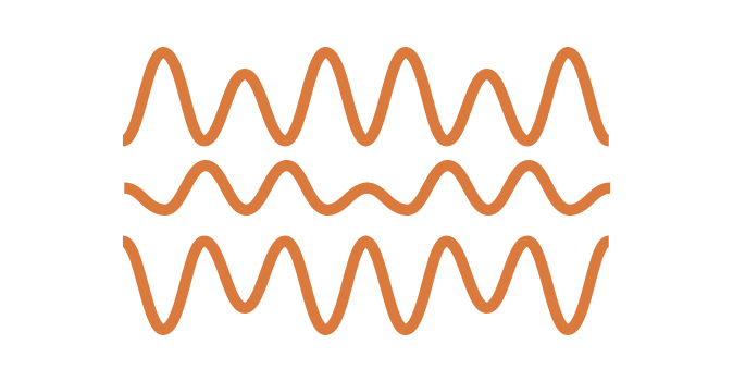
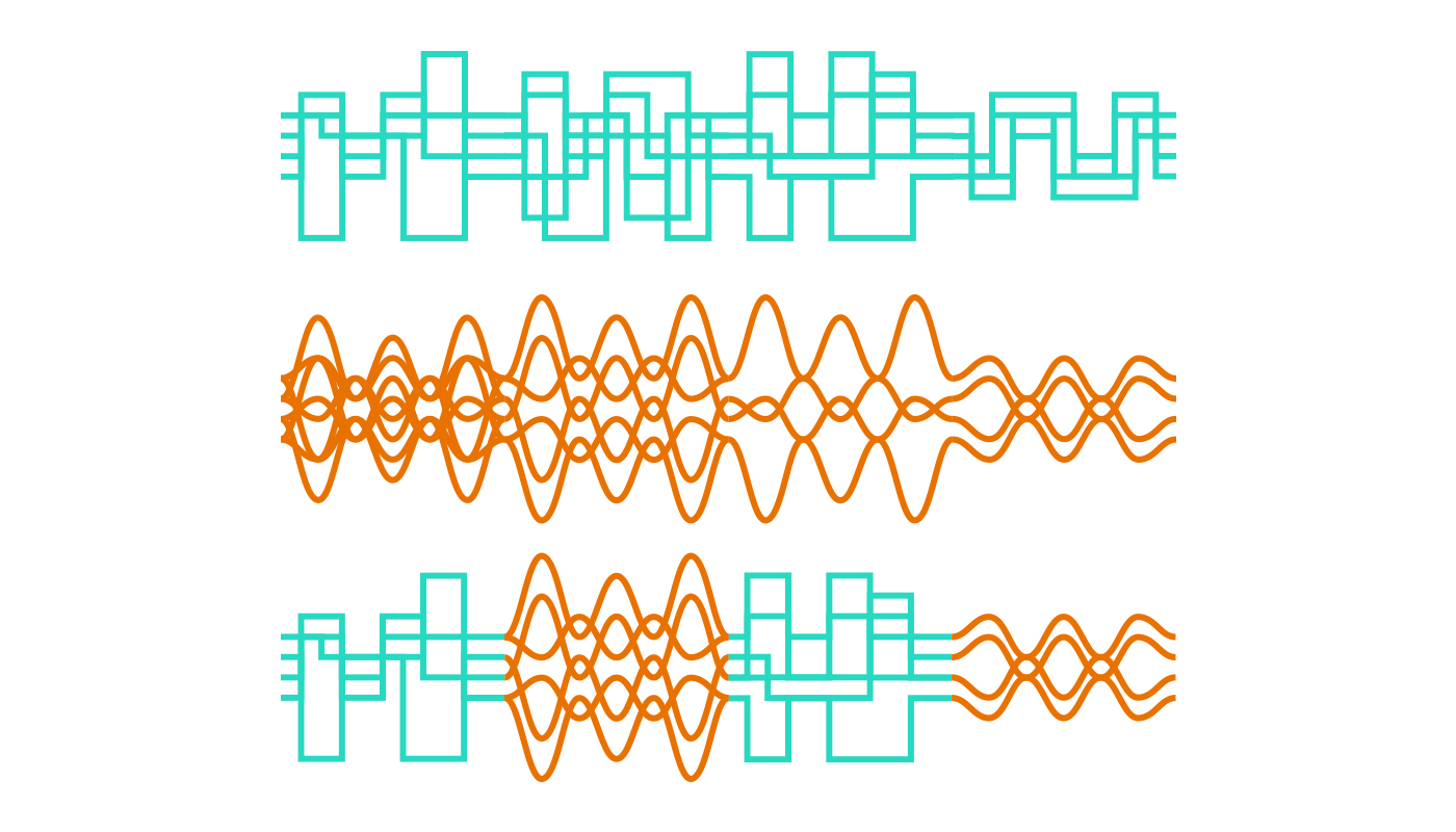
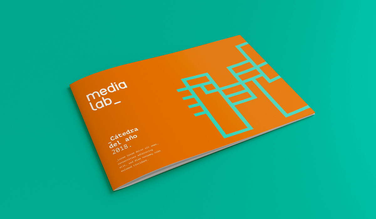
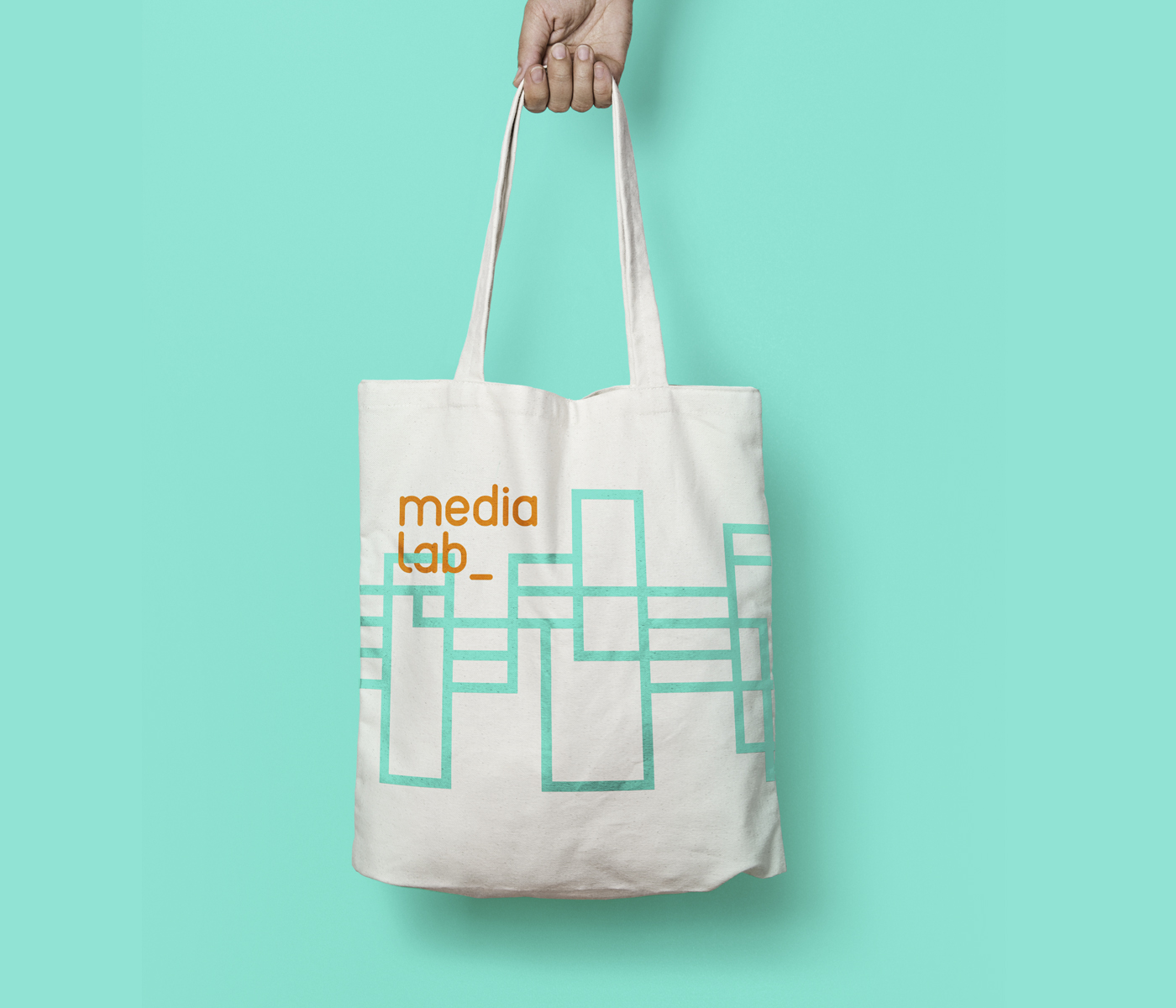
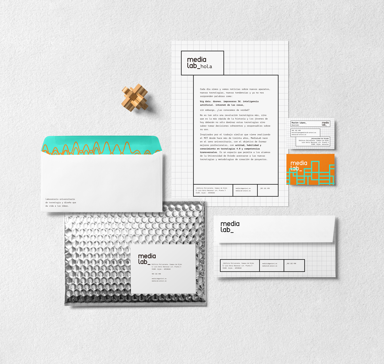
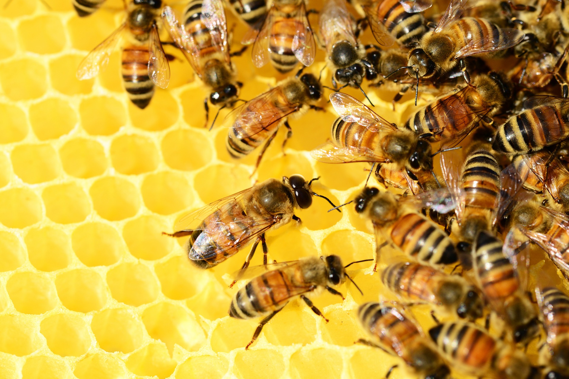
The design of the identity uses a visual language that is intended to be a claim for young people to participate and collaborate in a multidisciplinary setting. We use as a visual metaphor for the graphical representation of bits and atoms, a name of two of the fundamental spaces of the MediaLab_
We made special emphasis on the use of materials that are environmentally responsible, as the fabrics organic, paper, stone, etc

Graphic resources
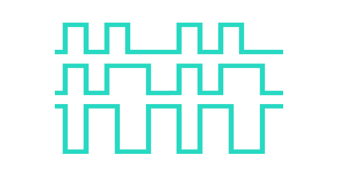
We take as a reference the graphic representation of the bits and atoms to create a visual code that could be mixed and create infinitely many solutions.

Colors
_Naranja
PANTONE 152C / #E87200
LAB: 63.77; 36.92; 52.4
HLC: 55; 64; 64
CMYK: 0; 45; 74; 11
sRGB: 228; 126; 60
LRV*: Approx. 33
*Light Reflectance Value
_Verde
PANTONE 333C / #2ED9C3
LAB: 78.24; 47.35; 1.68
HLC: 182;78; 47
CMYK: 79; 0; 10; 15
sRGB: 45; 217; 195
LRV*: Approx. 54
*Light Reflectance Value
_Negro
#000000
Typography logo
Reef Bold is a font with endings rounded, a style close and friendly that invites the approach. Following the philosophy of resources, open source, its license is free and can be downloaded easily from a myriad of websites.
Reef Bold

Typography corporate
PT Mono is a source of the so-called monospace fonts, the width of all characters is the same as for the that was used to set up complex documents, to control table widths, etc. reminds us of the style of the old scientific papers.
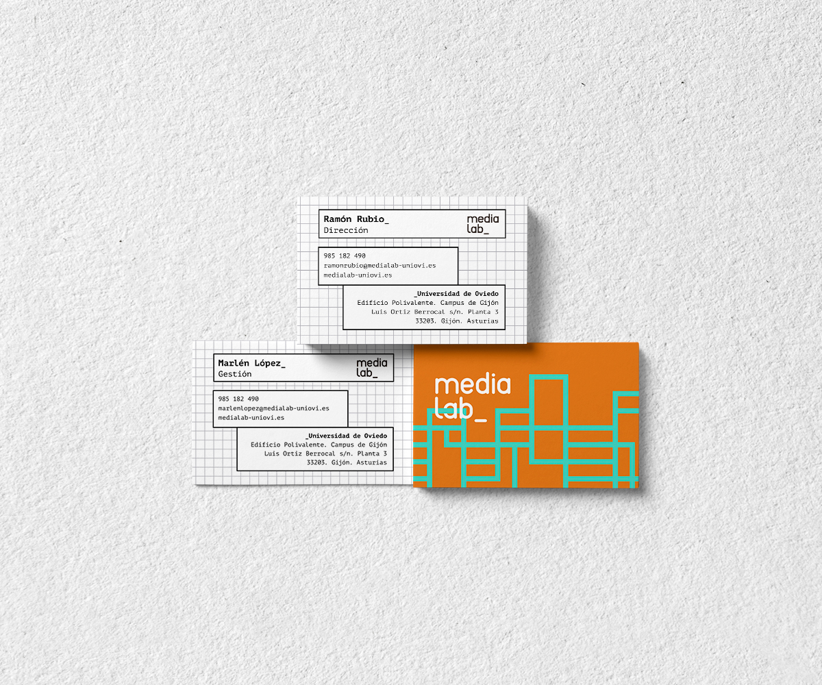
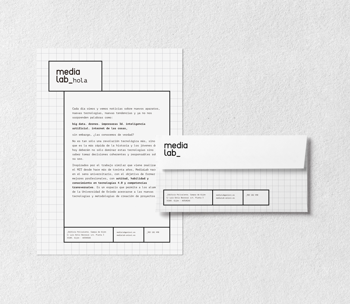
As a resource to corporate, will be used the underscore "_" at the beginning of holders or key phrases, as a reference to the script of the logo.
PT Mono
ABCDEFGHIJKLMNOPQRSTUVWXYZ
abcdefghijklmnñopqrstuvwxyz
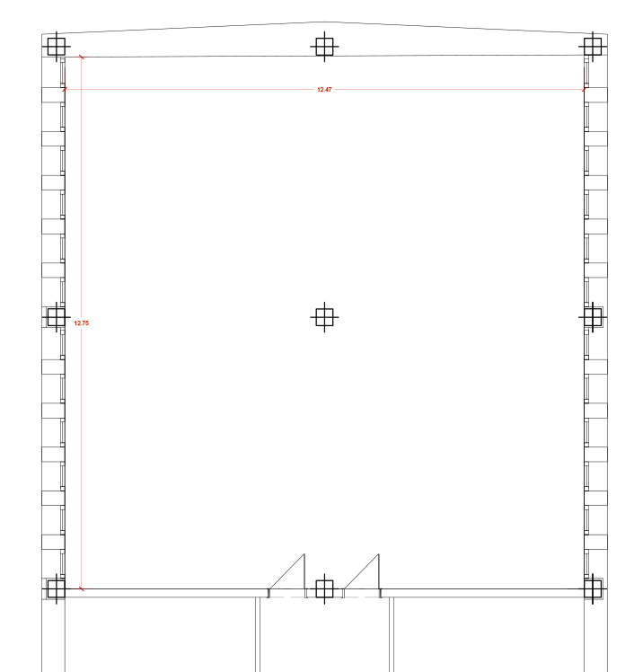
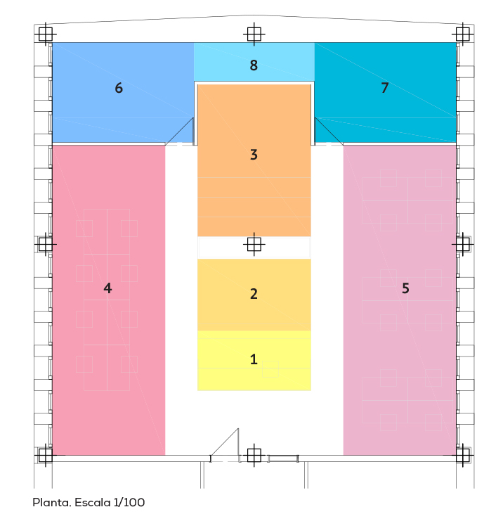
Dimensions
- 12,47 m x 12,75 m
- Total useful floor area = 155 m2
- H free = 2.50 m
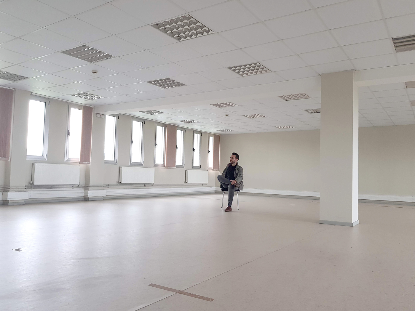
Design offices
Search for a spatial order through the sequence of parts that are interconnected.
From the beginning working on project ideas that arise from an approach to geometric to release the central space, as this will ease the situation and interconnection of the functional needs.
”“Geometry as a means of approach to the space it is able to generate an intrinsic order of the project.”
C. FerraterArchitect
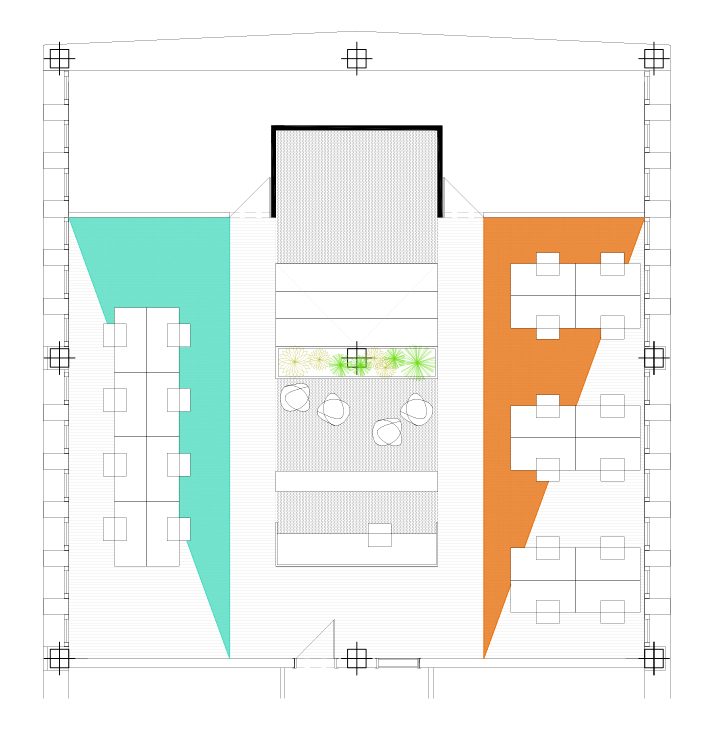
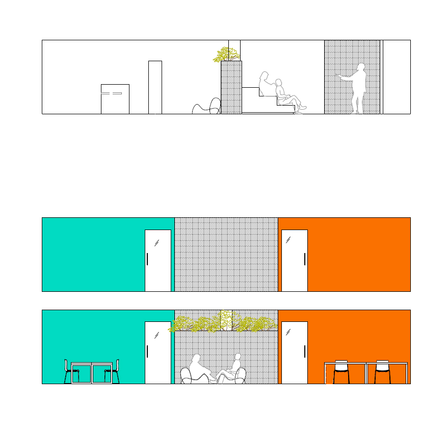
The space.
Open space with a central pillar and two access doors.
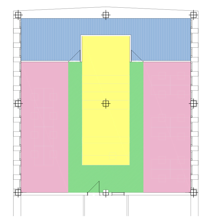
Functional Program
The functional program is structured in bands around the area of tours according to three zoning:
Yellow: Welcome, and spaces of public use and common.
Rosa: Spaces of creation and design.
Blue: meeting Areas.
Zoning
Zoning according to functional program:
Welcome and spaces of public use and common:
1. Reception and administration
2. Library
3. Audio-Visual Space
Spaces for the creation and design:
4. Training (workshops)
5. Research (Members in residence)
Laboratories of digital production and manufacture:
6. A café area. Meeting point
7. Meeting room
8. Storage


If you enjoyed this project, take a second to share it, thanks